An AI design system puts your brand to work
Give an AI agent the brand assets, examples and working methods it needs to turn a real brief into work your team can review and use.

You invest in a brand. Then comes the work of using it: launch posts, LinkedIn banners, sales decks and the next campaign. Each needs fresh content, a considered composition and someone who understands the identity.
For a founder or small marketing team, those everyday requests become a design queue. A library of templates helps until the content stops fitting.
An AI design system makes the brand usable by an AI agent. It brings together the source assets, the decisions behind the design and the methods for making new work. We’re developing this at Refract so a team can brief everyday production without having to explain its identity from scratch each time.
1. Start with a real piece of work
Imagine your team needs a LinkedIn banner for a product launch. You have the announcement, a product screenshot and a brand that already exists. The request sounds simple: make something that explains the launch and looks like us.
The agent still has decisions to make: which part of the announcement deserves the headline, whether the product image or the message should lead, how much detail will survive at feed size and where the logo belongs. A folder of assets gives it ingredients. It also needs guidance on how to use them.
The workflow we’re building starts with that brief. The agent finds the right source material, applies guidance for the format, produces a candidate and inspects the result. Your team reviews the work and asks for changes. The goal is an editable asset that answers the brief, with the brand decisions carried through into the finished composition.
The aim is to spend less time retrieving files and repeating instructions, and more time judging whether the work says the right thing. Whether the system delivers that saving has to be tested against the team’s actual process.
2. Give the agent more than a logo
We start with the material a designer would need: the identity, source files, fonts, imagery, existing layouts and examples of work the team considers good. We then record the relationships that make those examples work.
“Use this typeface” is one instruction. “Let the photograph lead, make the name the second read and place it in quiet space” explains a composition. The second gives the agent something useful to carry into a different image. It also gives the reviewer a basis for saying why a result feels wrong.
The same applies to the launch banner. A long headline may need a different composition from a short one. A product screenshot full of small controls may need a crop or a supporting detail. The system needs examples and working methods for making those choices, alongside the exact colours, type sizes and assets.
We package those methods as reusable skills: instructions, references and examples for tasks such as social design, websites and presentations. The intended experience is to make them available inside the AI agent your team already uses, alongside access to your brand material.

3. Review the work, then improve the guidance
The first output is a candidate. Someone still needs to decide whether it answers the brief, holds together visually and belongs to the brand. A file can have the correct logo, colours and dimensions and still be a poor piece of design.
Useful feedback names the problem. “The screenshot is too small to explain the feature” gives the next revision a direction. “Make it pop” leaves the same judgement unresolved. The system needs to show the work clearly, keep previous candidates available and apply feedback to the version the reviewer actually saw.

Some corrections should improve future work. If the agent repeatedly makes body copy too small, that belongs in the guidance for the format. If one campaign needs an unusually restrained layout, that may be a choice for that campaign alone. We review those lessons before making them reusable; the system does not automatically turn every piece of feedback into a new brand rule.
4. What we’re learning with Saunday
Saunday is a social sauna and ice-bath club. We’re using its existing identity as the first brand pack for this work, so the experiments have real source material and an established creative direction to answer to.
The early studies passed layout checks, but we rejected their creative quality. Getting the elements onto the page was not enough. The next explorations drew more deliberately on Saunday’s portrait language and its themes of recurring routine and neighbourhood connection.
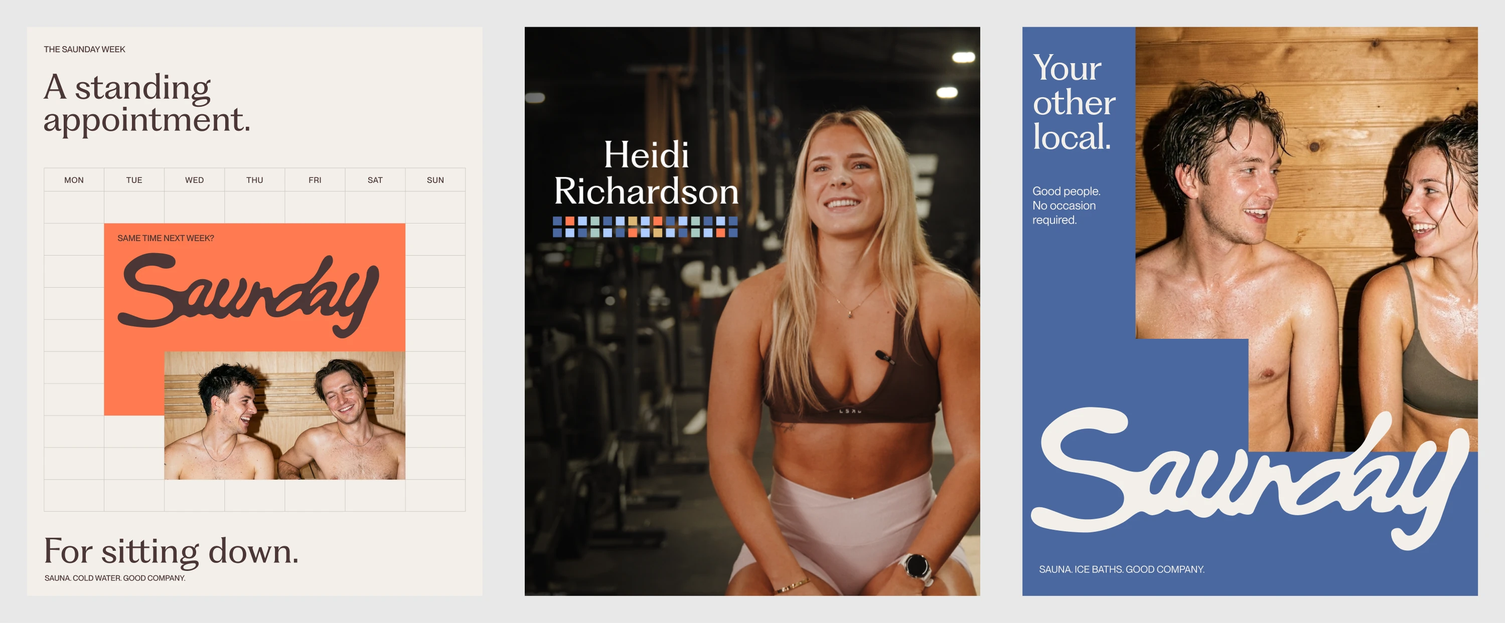
The existing portrait in the centre gives the experiments a concrete reference. The photograph leads; the typography supports the person and the atmosphere. The two surrounding compositions explore how those ideas might extend to other messages. They remain studies awaiting creative acceptance, rather than finished campaign work.
That distinction matters to the product we’re building. It must help a team reach work it would choose to publish. Producing a large volume of correctly sized options is not enough to establish that.
5. Prove one recurring task before expanding
Today, we have an initial skills library, the Saunday brand pack and a local, read-only connection that lets an agent access those resources. The integrated visual review loop, remote access and native delivery are still to be built. We’re proving those pieces before client rollout.
Start with a task your team already repeats, such as a launch banner, a sales-deck section or a regular social post. Bring a recent brief and the work you accepted. They give the trial a real point of comparison.
Run a new brief through the workflow, including the revisions a normal job would need. Measure the time to accepted work, the amount of human correction and whether the result can be edited and reused in the intended tool. Include the effort to set up and maintain the system. A quick first draft only helps if the complete job becomes easier.
Written on by