Morse Micro - Process breakdown
An overview of Refract’s engagement with Morse Micro, covering the website strategy, design, development, content rollout, QA, and launch process across key product, applications, field-trial, and case-study pages.
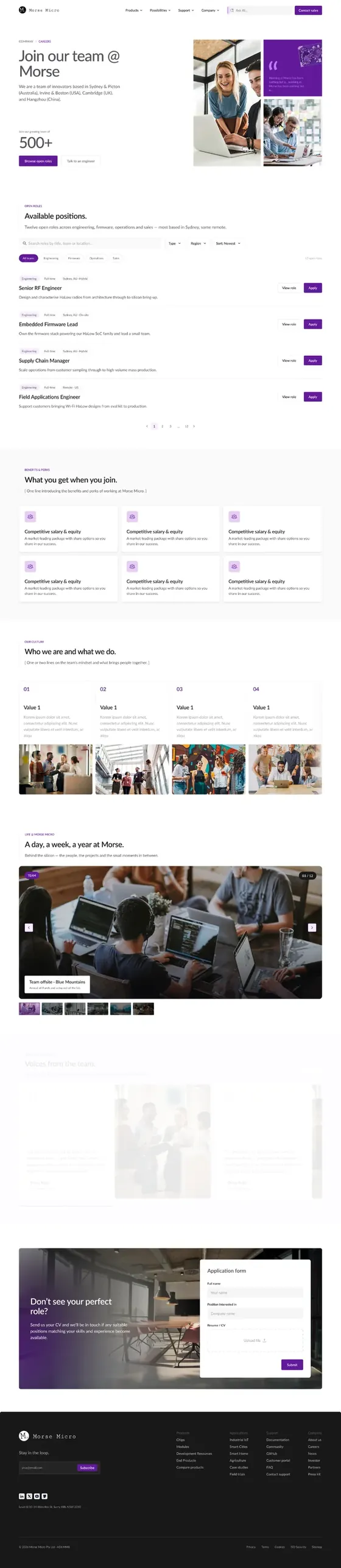
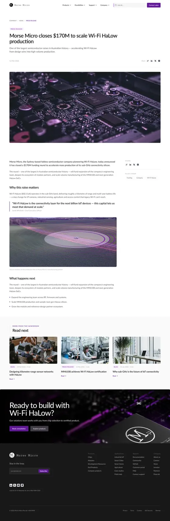



Overview
Morse Micro needed a new digital platform that could communicate a technically complex product ecosystem to multiple audiences: engineers, partners, investors, customers, and prospective hires.
The project brought product information, technical resources, applications, company content, and investor communications into one clearer, more scalable website experience.
Process
We used a three-phase process to turn Morse Micro’s complex technical ecosystem into a clear, scalable digital platform. We started by understanding Morse Micro’s business, audiences, and key user journeys. These insights shaped the sitemap, content hierarchy, wireframes, and visual direction - balancing brand storytelling with technical clarity. We then brought the system to life in Webflow with reusable templates, CMS structures, and scalable components.
 Define
- Stakeholder workshop
- 3 weeks
- Interviews
- 1 week
- QA
- 1 week
- Userflows
- 2 weeks
 Ideate
- Site map
- 3 weeks
- Moodboarding
- 1 week
- Low-fi design
- 6 weeks
- Design system
- 1 week
 Execute
- Hi-fi design
- 3 weeks
- Content and CMS audit
- 1 week
- Web development
- 1 week
- Userflows
- 2 weeks
Our strategy was to serve different audiences without fragmenting the experience. Engineers needed quick access to specifications, documentation, and product comparisons; commercial visitors needed a clearer view of real-world applications; and investors, partners, and future talent needed confidence in the company’s scale, momentum, and ecosystem.
This led to a connected platform rather than a collection of pages. Products link to relevant modules, evaluation kits, resources, partners, and applications, while persistent search supports fast, technical exploration. Behind the scenes, we combined flexible CMS content with controlled components for complex information, giving Morse Micro the ability to evolve the site without compromising clarity or consistency.
Problem
Morse Micro had a sophisticated product ecosystem, but the existing website needed to make it easier for different audiences to quickly understand what the company offers, how the products relate, and where Wi‑Fi HaLow fits in real-world use.
The project had to bridge a gap between:
Technical depth...
... for engineers evaluating chips, modules, evaluation kits, and documentation
Commercial clarity...
... for partners and prospective customers
Strategic confidence...
... for investors, candidates, and the broader market
We needed to make the ecosystem legible.
Early discussions highlighted the importance of showing the full product breadth without hiding it behind generic navigation. One rationale was that investors should be able to immediately see the scope of the product offering as they explore the site.
The information architecture also needed to accommodate distinct content types. Product categories could not all be handled as one generic CMS experience; individual product pages needed scalable CMS structures, while chip pages required more detailed, specialised content such as tables and diagrams.
Discovery
Discovery focused on turning a broad set of stakeholder needs into a clear direction for the website.
Workshop: Aligning the business around the problem
We began with an in-person workshop at Morse Micro’s office, bringing together stakeholders from across the business. The session aligned the team on audience priorities, technical requirements, content structure, and the role the new website needed to play.
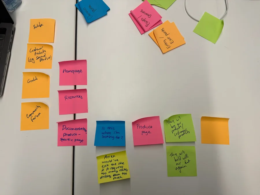
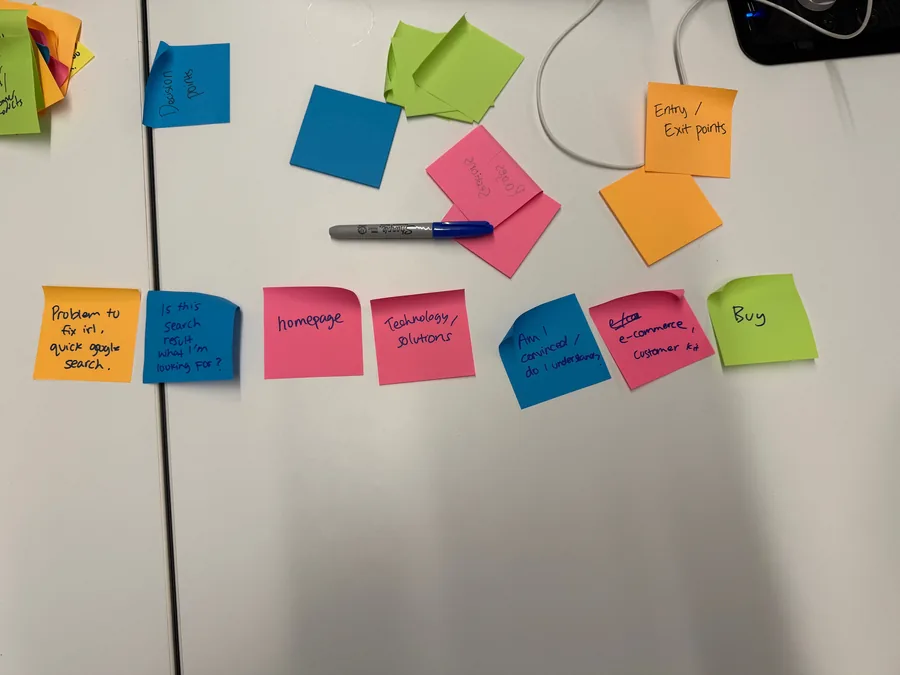
It gave us direct access to the perspectives shaping the product - from engineering and documentation through to marketing, partnerships, growth, and investor readiness - and created a shared foundation for the strategy, sitemap, and user flows that followed.
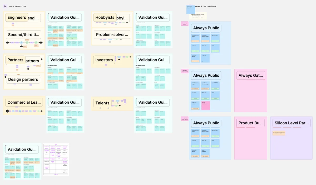
We mapped the major audiences:
 ENGINEERS
Insights
Engineers were the most important audience because product adoption depended on helping them evaluate and work with Wi‑Fi HaLow confidently.
Needs
Need fast access to specs, comparisons, documentation, SDKs, GitHub, and search.
- MODULE PARTNERS
Insights
Module partners integrate Morse Micro chips into their own products. They have high technical knowledge and need to assess compatibility quickly.
Needs
Need clear compatibility information, technical detail, and links to relevant chips, kits, and resources.
- COMMERCIAL LEADERS
Insights
Commercial visitors were not treated as one fixed job title. This “commercial browsing mode” could include executives, product specialists, or people gathering information for internal approval.
Needs
Need quick proof of industry fit through use cases, partners, and real-world validation.
- INVESTORS
Insights
Investors needed to quickly understand the company’s technology, product breadth, market relevance, traction, and momentum.
Needs
Need a clear view of Morse Micro’s technology, product breadth, market momentum, and credibility.
- FUTURE TALENT
Insights
Potential employees needed to understand what Morse Micro does, why the work matters, and what it would be like to join the company.
Needs
Need to understand the company mission, culture, technology, and available opportunities.
- HOBBYIST
Insights
This audience needed a lower-friction entry point into the technology.
Needs
Need an accessible entry point to products, evaluation kits, community, and technical resources.
Stakeholder interviews: understanding priorities and constraints
We then validated the workshop outputs through stakeholder sessions across the business.
Prioritise engineers, without excluding everyone else.
The site needed to make documentation, product detail, comparisons, and technical resources easy to find.

Design for multiple modes of exploration.
Visitors might arrive to browse products, explore applications, validate a business case, find support, or search for a specific technical resource.

Use structured pathways instead of generic sales CTAs.
The site needed to guide people to the right information, product, resource, or use case at the right time.
User flows: turning insight into a site architecture
We converted these findings into testable statements and audience-specific flows. We validated how different users would potentially move through out the site
I want to find a technology solution
Portfolio of the chips
Data throughput
Power consumption
Interfaces
Operating system
Browse mode (Access information e…
Detail page
Product brief
Advanced data sheet
Does it solve the problem?
END
Download documents
END
Attributes
Need a clear introduction to Wi‑Fi HaLow, Morse Micro’s product ecosystem, and where to begin. They benefit from guided pathways into products, use cases, and evaluation kits.
I want specific documentation and/or software
Home Page (Search)
Documentation Hub
Is it there?
END
Download documents/ Login
END
accessing information without logging in if enough info is available
I want support
Support
Community
Is there any support?
END
Register/ Login
Portal
Create a ticket
END
They would login to post questions if not enough support is found.
Ideally only tickets from tier 1 customers, and the rest ideally seeks info from community/github
Need to get to technical information quickly, often through search. They prioritise direct access to specs, documentation, SDKs, GitHub, and product comparisons.
Sitemap
The sitemap was designed to support both browsing and search. A visitor can begin with a product, an application, or a specific technical question, then move easily into the relevant resources, partner ecosystem, and next step.
Technology
TECHNOLOGY
Wi-Fi HaLow Overview
Hero section - Static content
What is Wi-Fi HaLow - Static content
The problem it solves - Static content
Key benefits - Static content
Common use cases - Static content
FAQ (incl. How it works) - Template content
CTA + Footer - Template content
HaLow Vs LoRa
Hero section - Static content
Future of IoT 2.0 - Static content
Download whitepaper - Static content
Comparison (simple vs engineering) - Static content
CTA + Footer - Template content
Range
Hero section - Static content
Range explanation - Static content
Download results - Static content
Results panel - Static content
Field Trials - CMS content
FAQ (incl. How it works) - Template content
CTA + Footer - Template content
- Template content
- CMS content
- Static content
The technology section explains the foundations of Wi‑Fi HaLow before users enter the product catalogue. It gives engineers, developers, and commercial audiences a shared understanding of the technology’s capabilities, including range, power efficiency, connectivity, and real-world applicability. This section makes the technical proposition more accessible while creating a stronger bridge between Morse Micro’s core silicon offering and the outcomes it enables.
Visual ideation
The visual direction was designed to make Morse Micro feel more modern, confident, and accessible, without losing the technical credibility expected from a semiconductor company.
We explored a spectrum of approaches, from expressive, image-led layouts and bento-style compositions to more minimal, technical systems built around linework, modular panels, and product-led detail. The final direction combined both: bold visual moments to communicate ambition and real-world impact, followed by clean, structured content that supports deeper technical evaluation.

Expressive and brand-led
A more playful, image-led direction using Morse Micro’s brand colours, bento-style layouts, stronger CTAs, and richer visual storytelling. This gave the brand more personality and made applications feel more tangible.







Illustrated and conceptual
A direction built around 2D illustration and custom visual assets. It created a more distinctive world around the technology, but was considered less aligned with the existing brand and harder to scale without an ongoing illustration system.

Technical and minimal
A more restrained system using clean layouts, simple lines and shapes, technical cues, accent colours, and subtle glass or layered-panel treatments. This direction prioritised product clarity, specifications, and technical confidence.
What we landed on
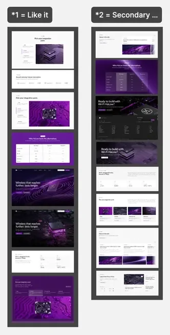
We combined the strongest parts of the expressive and technical routes into a hybrid system.
- Bold, visual hero moments to create impact and communicate Morse Micro’s ambition
- Structured, technical content below to support engineers and product evaluators
- Subtle depth through layered panels, restrained shadows, and shifting backgrounds
- Simple, clean layouts that avoid visual noise or unnecessary animation
- Functional interactions, such as hover states and visual product prompts, to make complex product pathways easier to explore
- A scalable component library of reusable hero, gallery, CTA, and content-section variants
Low-fi design
Low-fidelity design turned the discovery insights into a practical site structure before visual styling began.
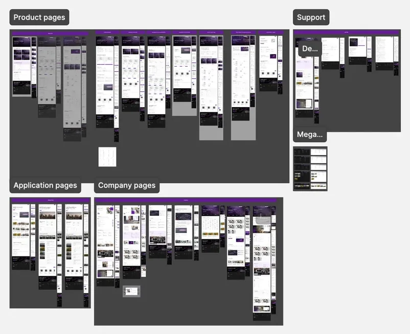
We mapped the key journeys across products, applications, support, and company content, defining what each audience needed to see first, what information should sit deeper in the experience, and how pages should connect. This included product comparison flows, documentation pathways, partner journeys, support routes, and industry-led application pages.
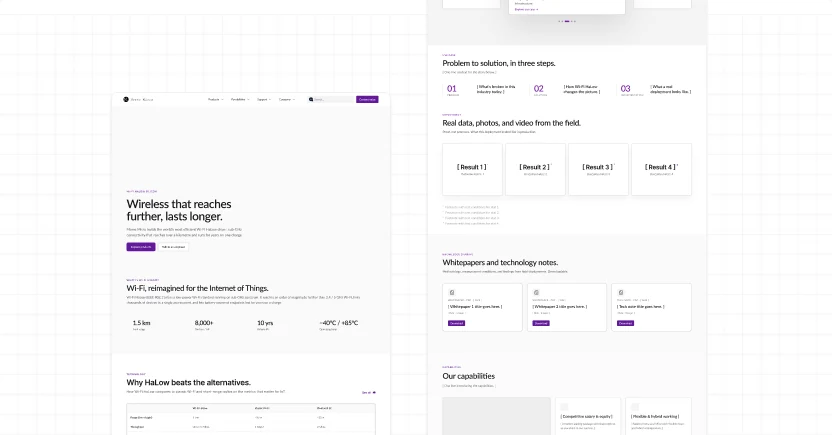
The wireframes established a flexible page system.
- Portfolio overview pages that lead into product categories and part numbers
- Product-detail templates for specifications, diagrams, comparisons, resources, and related products
- Application templates that connect technical capability to real-world proof
- Support pathways for documentation, GitHub, community, portal access, and search
- Company pages for credibility, careers, partners, news, and investor information
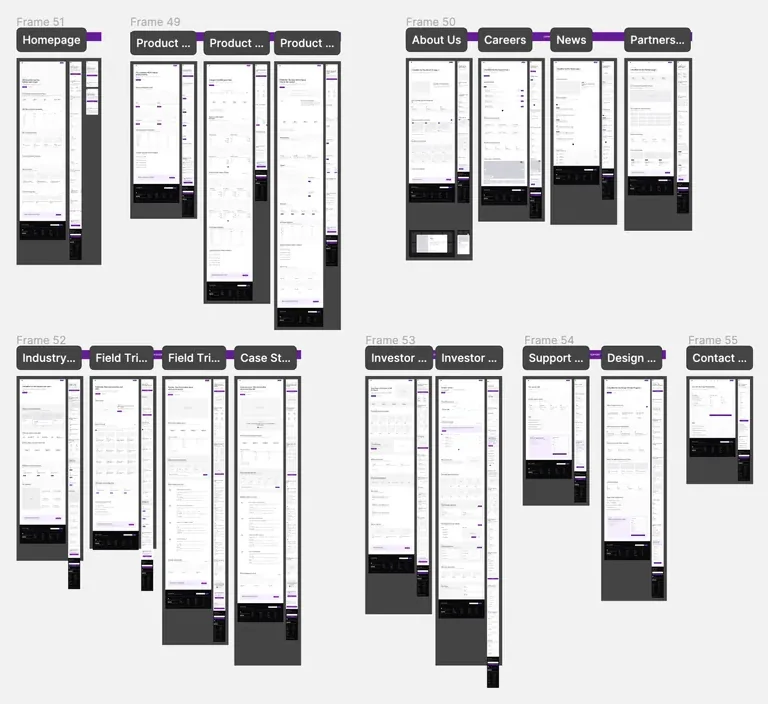
We used this phase to test navigation and content hierarchy early. Feedback helped refine the mega menu, make search persistent, introduce clearer cross-linking between products and resources, and simplify the top-level structure into Products, Applications, Support, and Company.
Hi-fi design
Low-fidelity design turned the discovery insights into a practical site structure before visual styling began.
We mapped the key journeys across products, applications, support, and company content, defining what each audience needed to see first, what information should sit deeper in the experience, and how pages should connect. This included product comparison flows, documentation pathways, partner journeys, support routes, and industry-led application pages.
Design System
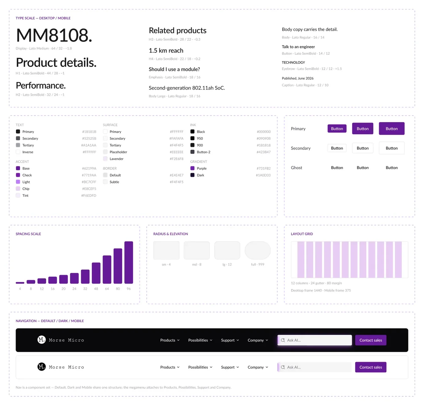
To make a large, content-rich website feel consistent, we created a flexible design system that could scale across every part of the Morse Micro ecosystem.
The system defined the core visual language: typography, spacing, grids, colour usage, buttons, cards, navigation, imagery, and interactive states. It paired expressive brand moments with structured technical components, allowing the site to shift naturally between high-level storytelling and detailed product evaluation.
- Accent/Base#62199A
- Accent/Light#BC7CFF
- Accent/Chip#E8CEF5
- Ink/950#09090B
- Gradient/Dark#1A0D33
- Surface/Tertiary#F4F4F5
We used this phase to test navigation and content hierarchy early. Feedback helped refine the mega menu, make search persistent, introduce clearer cross-linking between products and resources, and simplify the top-level structure into Products, Applications, Support, and Company.
Navigation design
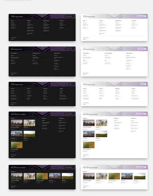
We designed the navigation to make Morse Micro’s breadth visible without adding friction. The mega menu gives visitors a clear view of the full product ecosystem - from product categories through to individual chip families rather than hiding key pathways behind multiple clicks.
For engineers, it supports fast browsing between chips, modules, evaluation kits, resources, and documentation. For commercial and investor audiences, it makes the scale of the product portfolio immediately visible and easier to understand.
Final thoughts
Working with Morse Micro was a genuinely rewarding partnership. The team brought a rare combination of deep technical knowledge, clear ambition and real care for how their technology should be understood by everyone from engineers and partners to prospective customers.
That made this far more than a website project. Together, we worked through the information architecture, product hierarchy, application journeys, CMS structure, documentation experience and launch process to build a platform that could grow alongside the business. Frequent feedback, decisive approvals and an openness to test ideas meant we could move quickly without losing sight of the details.


“It’s been a great pleasure working with the brilliant team at Morse Micro. From the outset, the collaboration was defined by a shared commitment to clarity - aligning the sitemap, product architecture, content and visual direction around a complex technology story. The team’s openness, speed of feedback and attention to detail made it a rewarding partnership.”