Crimson
Crimson Education gets students into the most selective universities there are. Every firm in the category promises that same outcome in more or less the same words, so what is left to build is the identity underneath it — the mark, and the colour it has to survive on.
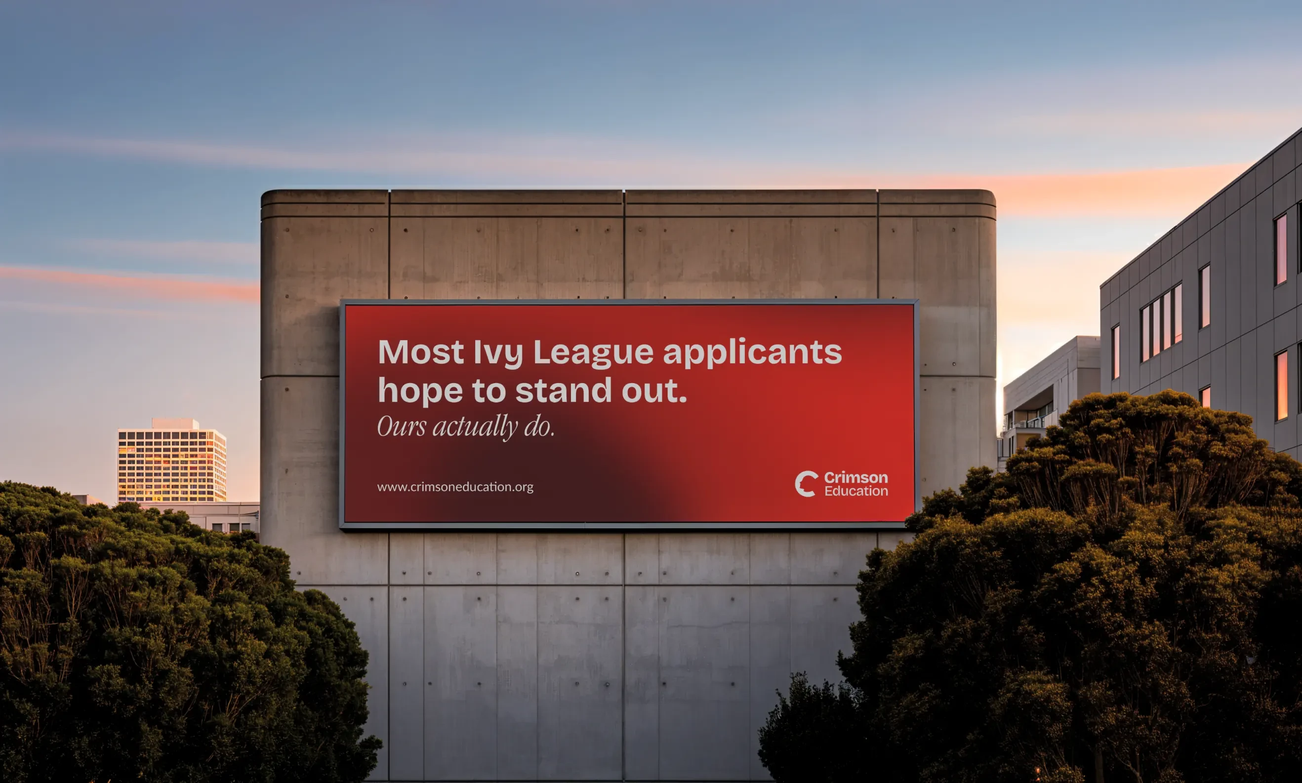
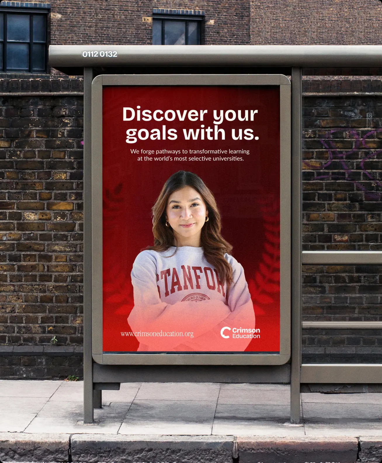
Recognisable at a hundred metres
A face is cut into the counter of the C, and it is the only figurative thing in the system — everything else is type and colour. Bricolage Grotesque sets every headline: it carries weight without going condensed, which is what a line of it needs at a hundred metres.

A red with range
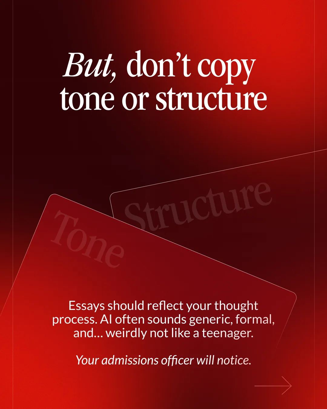
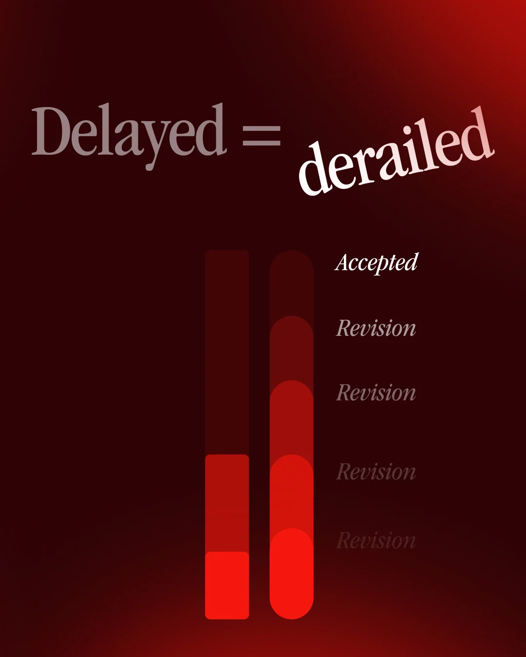
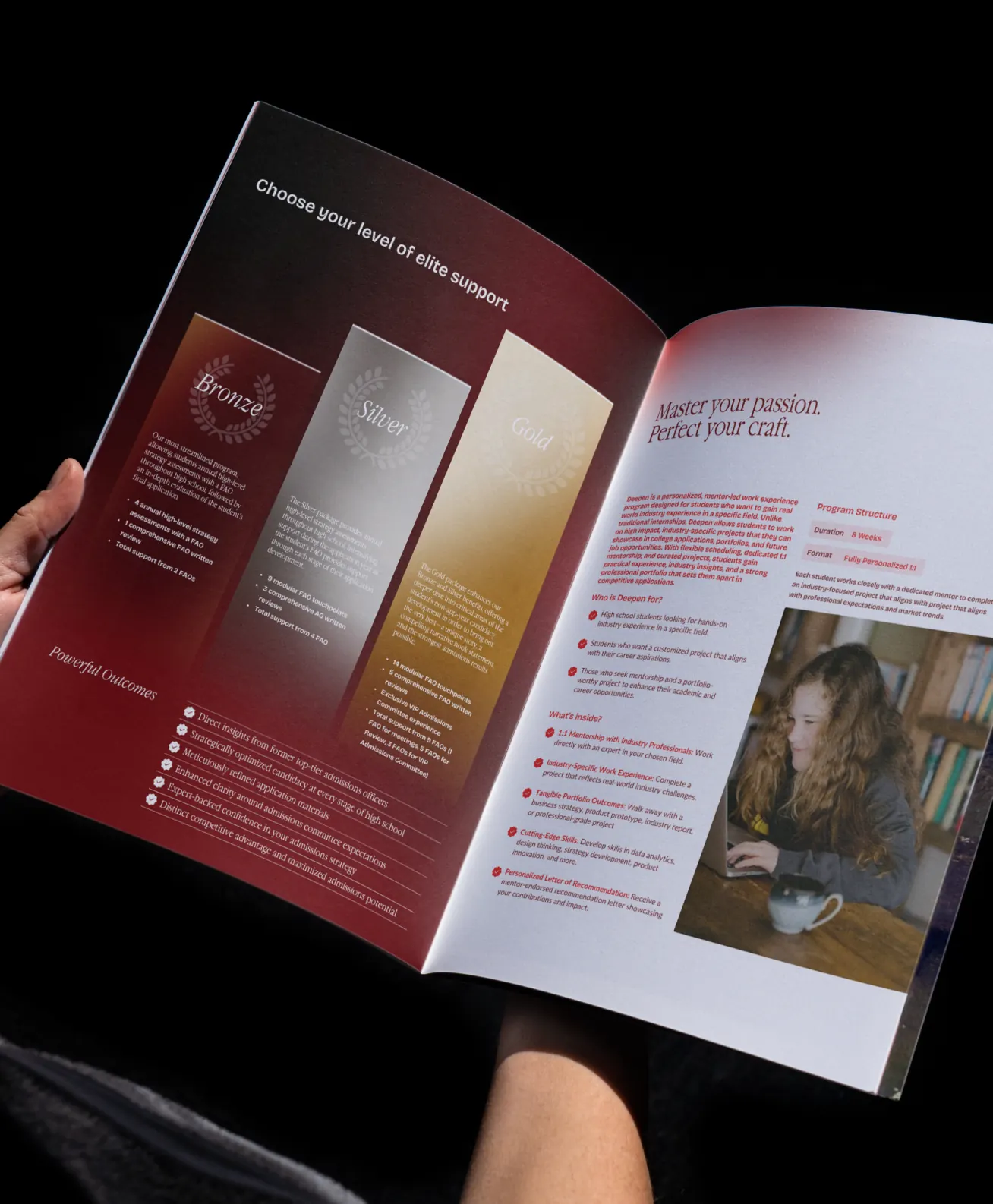
Colour is specified as six gradients. A swatch is a value a surface can be; a ramp is an axis it can sit anywhere along, which is what lets one red hold a lit billboard and a caption under a thousand words of admissions advice.










Reflection
Crimson can hand this to a printer or a media buyer without a conversation about which red. Every surface sits somewhere on a ramp that was signed off once, and the mark keeps its grid at whatever size it lands.