Kaizn
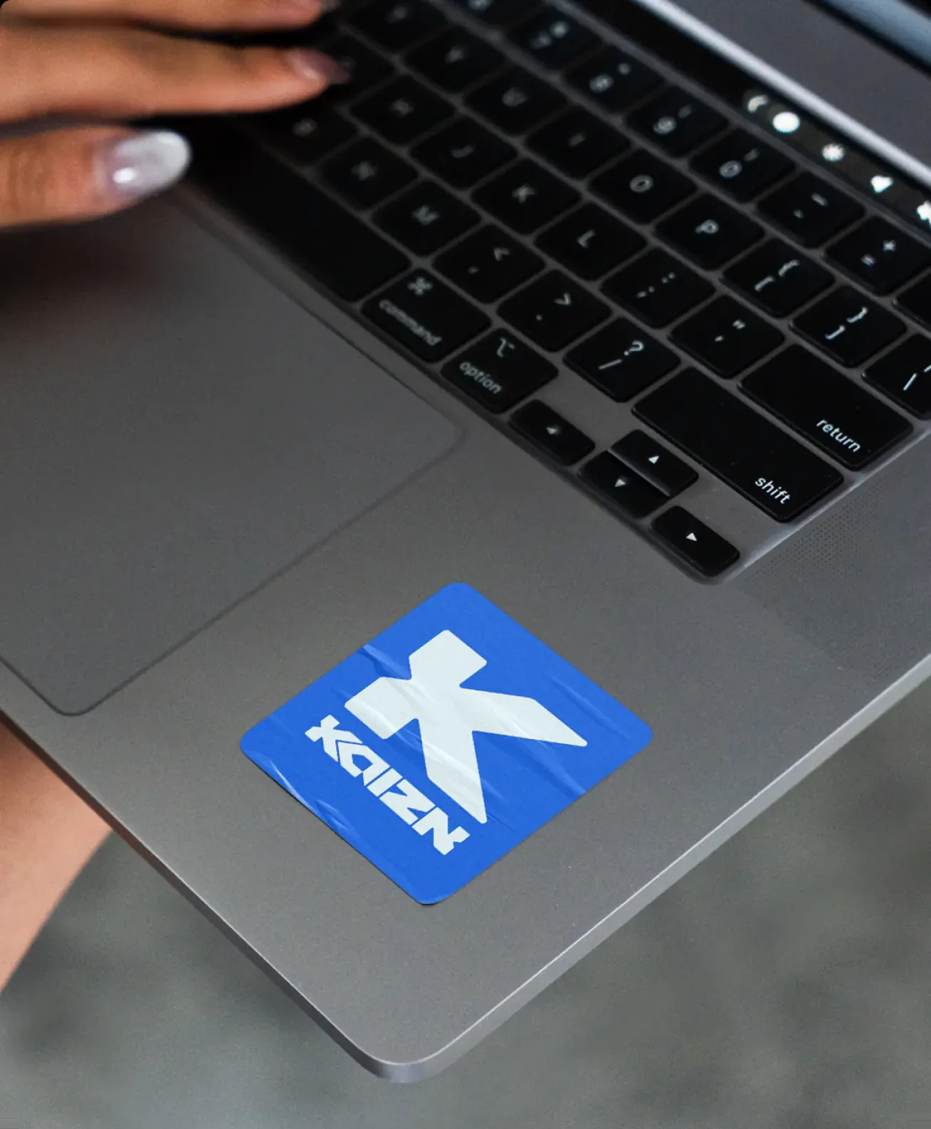
A bold identity developed to stand out among the crowd. Kaizn supplies and develops software for contact centres, ensuring clients always have what works best for them. The Kaizn brand is built from strong colours that assert knowledge, without being overbearing or dark. A brand that cuts through chaos, sparks trust and proves that technology doesn’t have to be complicated to create impact.



Impossible to miss on a trade floor
Contact centres are a noisy place to sell into, and most of the category answers that by going dark and technical. Kaizn's colour is strong enough to be seen across a trade floor, and the type stays plain so it reads as confident at that volume.






Reflection
Every contact centre software brand looks the same and says the same thing. We went loud on colour so Kaizn gets recognised across a room, before anyone reads the name.