Mono AI
Monō builds production AI systems for organisations making consequential decisions about adopting them. Most AI brands answer that with speed and spectacle: glowing gradients, abstract bots, claims that outrun the product. For a company selling careful implementation work, that tone works against the pitch.
Tone gets read first
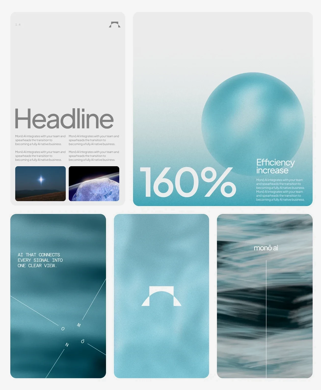
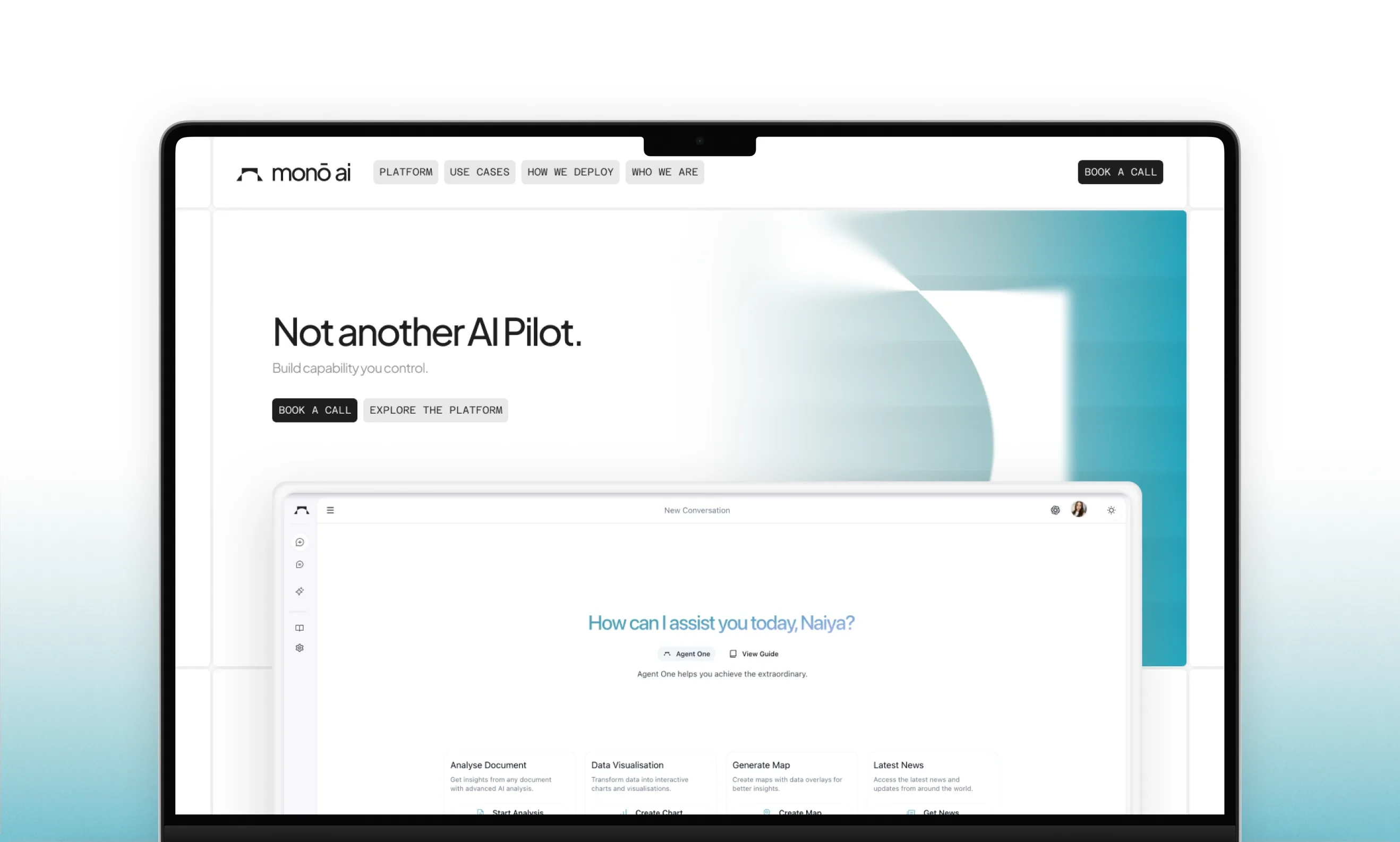
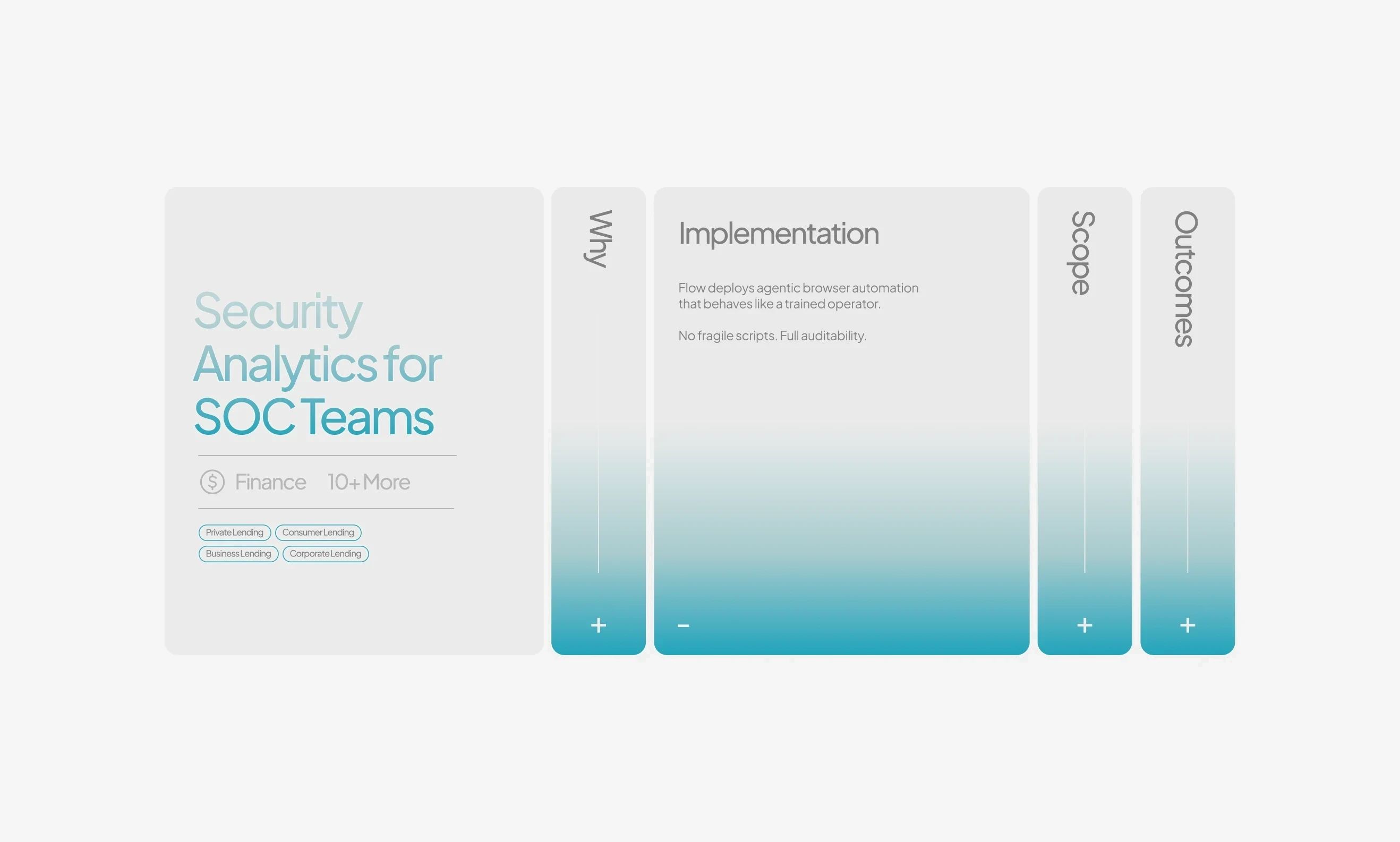
We started with what the brand should make someone feel, then decided how it should look. The brief asked for peace, reliability and credibility, so the whole system is tuned quiet. Type is precise and set in a hierarchy you can scan. Space is generous, so the messaging gets room and stops competing with itself. Colour is held back, used for depth and not for volume. Someone weighing an AI decision reads tone before they read capability.
Solved at its smallest
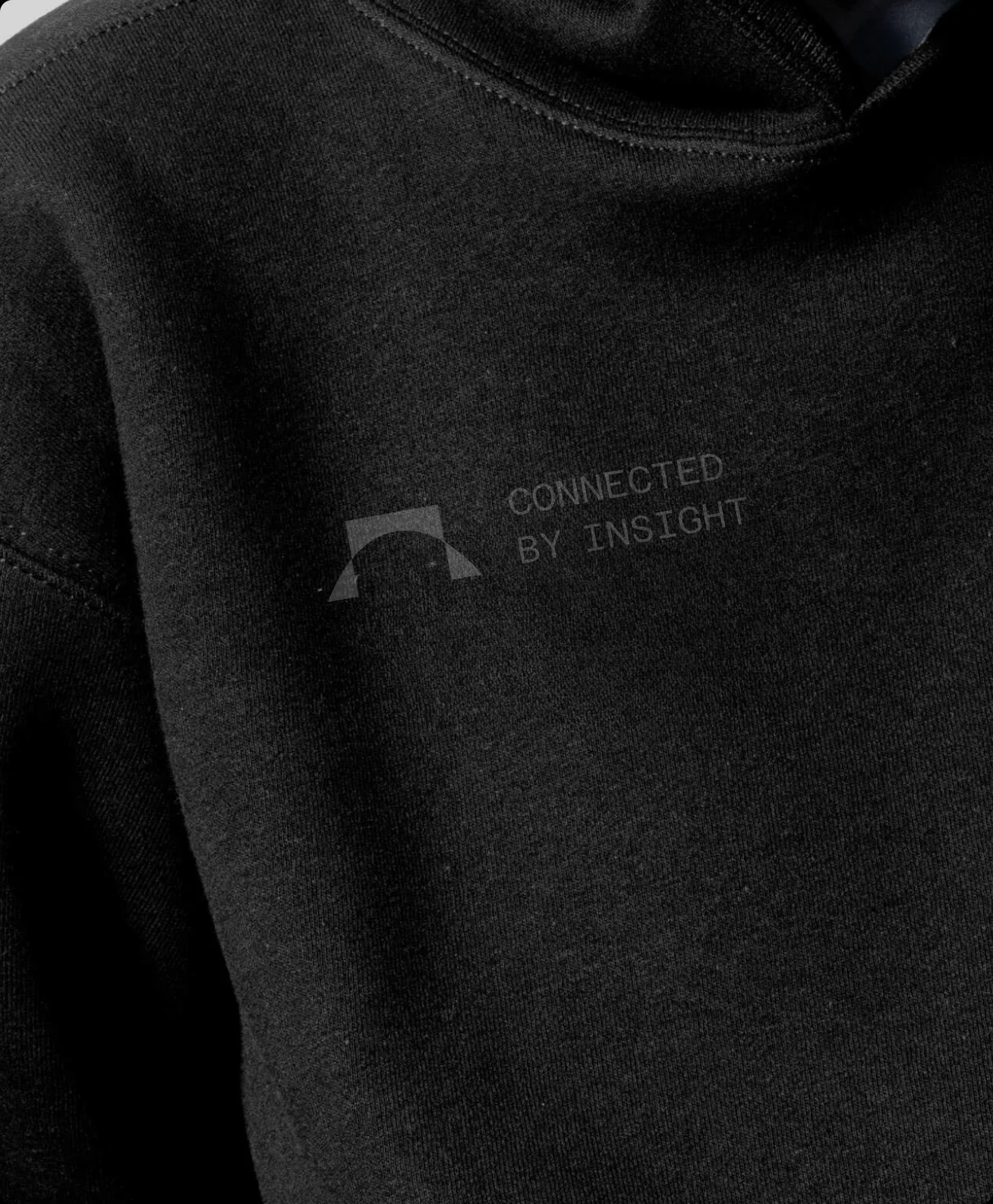
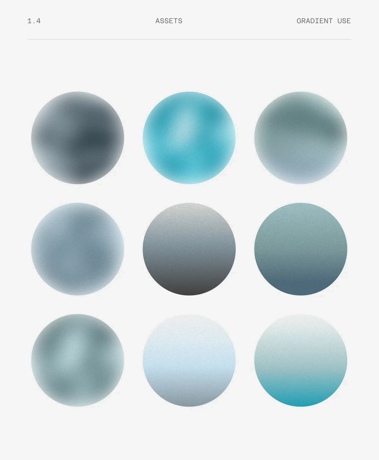
Most of the work was subtraction. We drew the mark on a favicon grid first, at the size where it has the least room, and resolved its geometry there before setting it beside the name. The palette runs from white to obsidian through one blue, which gives a page depth without raising its volume. Type carries the hierarchy on its own, so a page can hold a technical idea and still be scannable.