Prism
Prism gives service businesses one view of the work happening across their organisation: business context, projects, people and AI support in the same place. It lands in a category full of the same futuristic visuals, and the brand had to read as intelligent without going technical or abstract.
Textures that read as movement
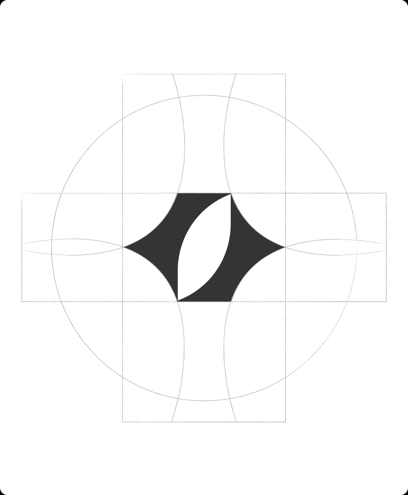
We built the direction around movement, momentum and connection. Pixel textures and graphic forms carry the sense of systems in motion. Typography stays simple, which keeps it direct and keeps the dense parts navigable. It reads energetic and contemporary, with enough restraint to sit under decisions people are making about how their business runs.











Active and useful the moment it opens
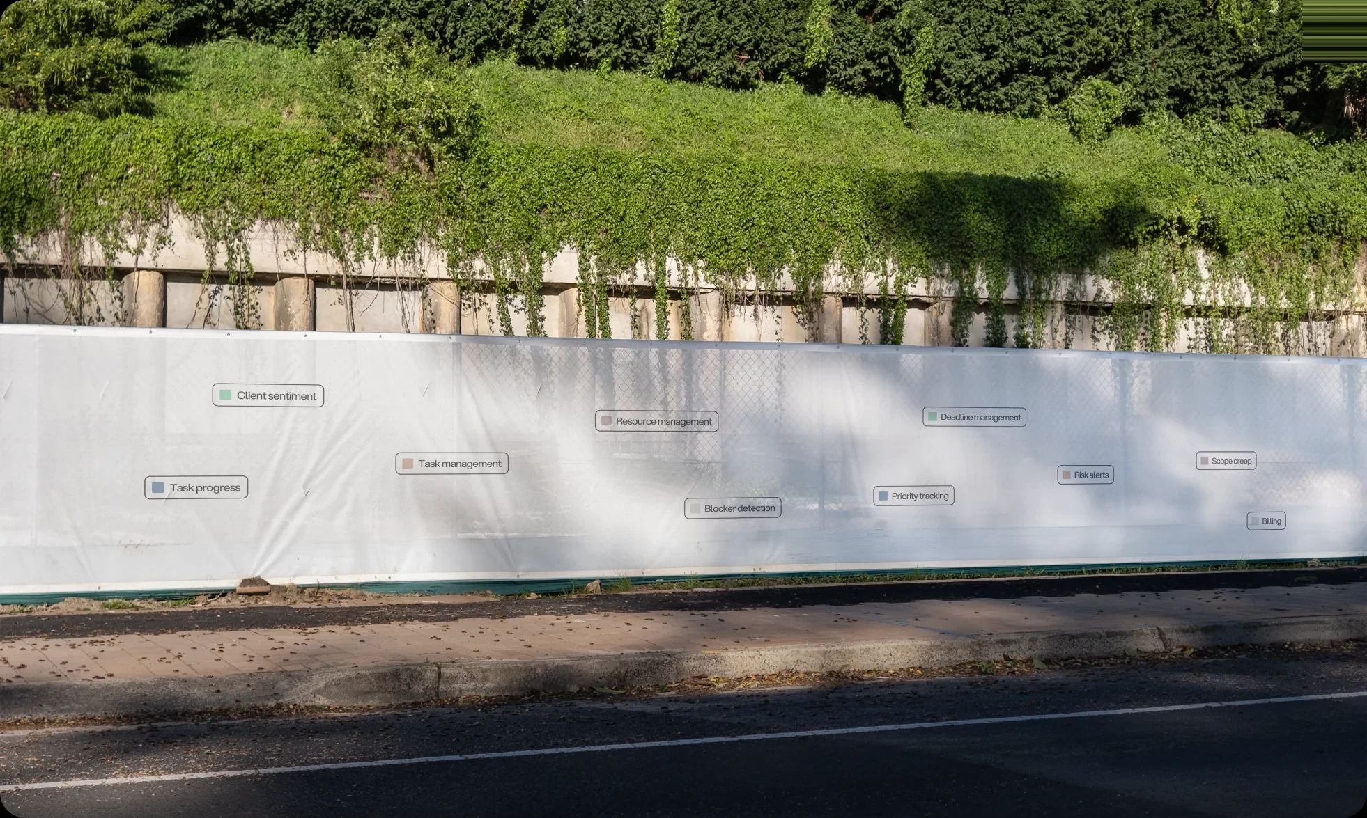
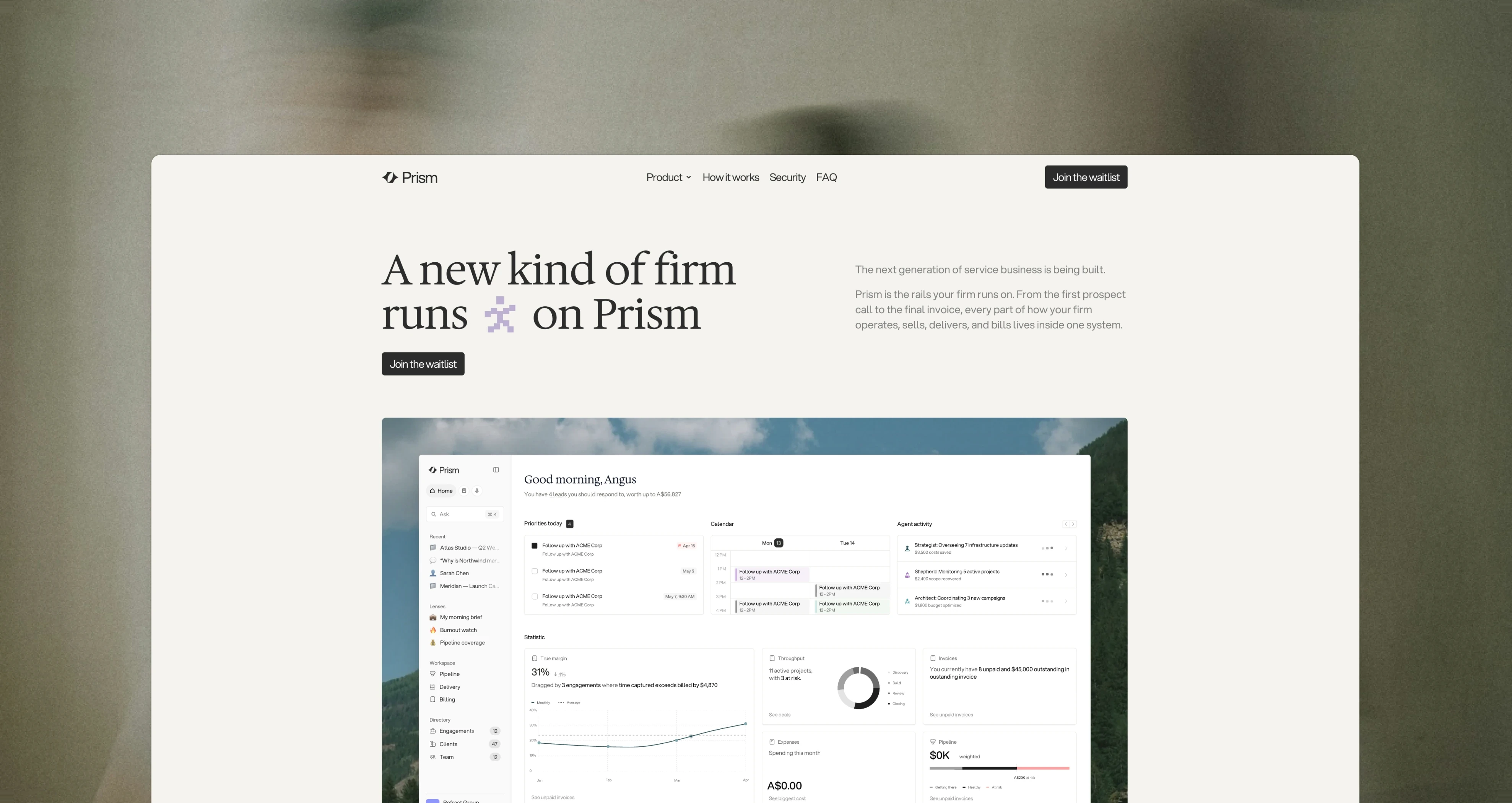
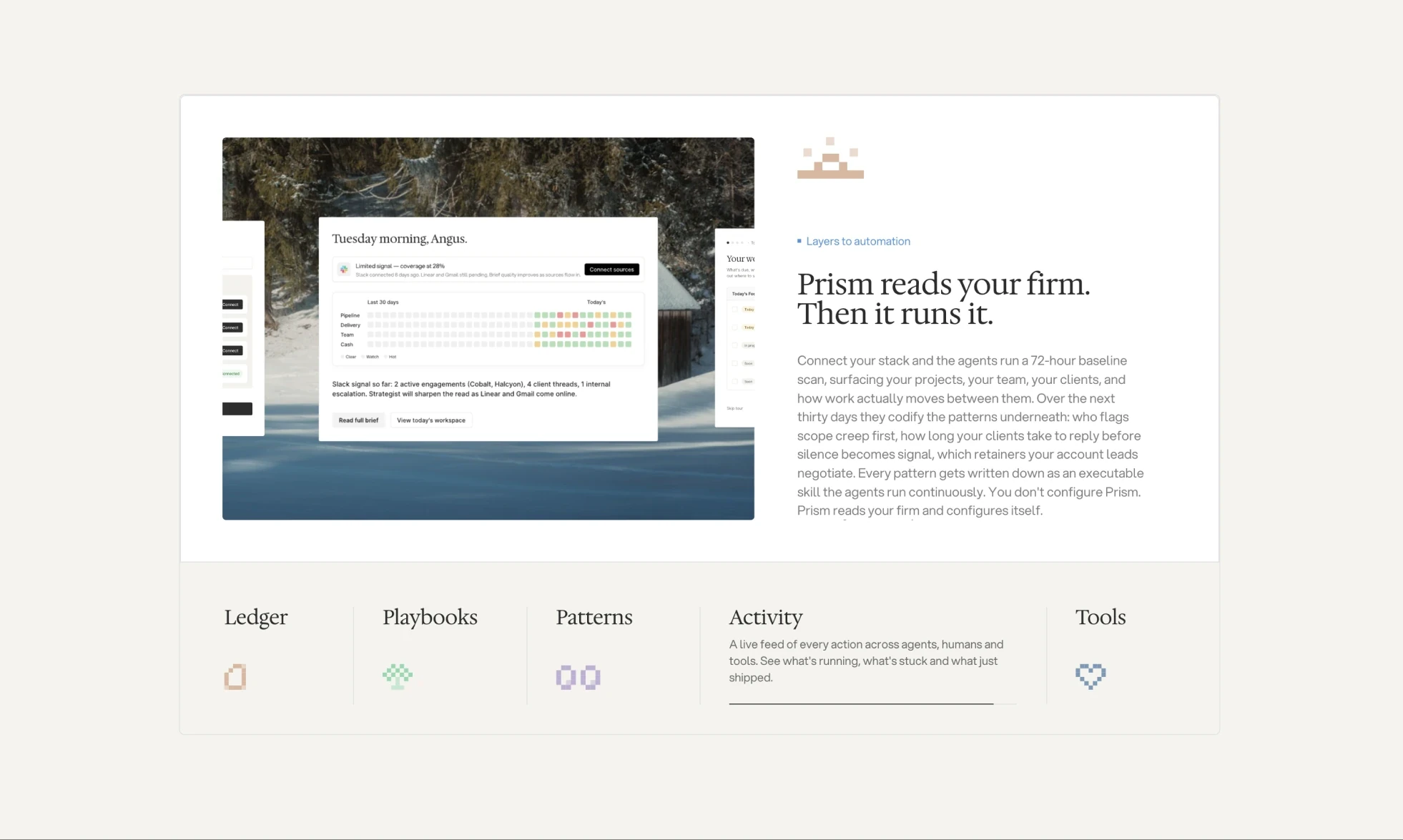
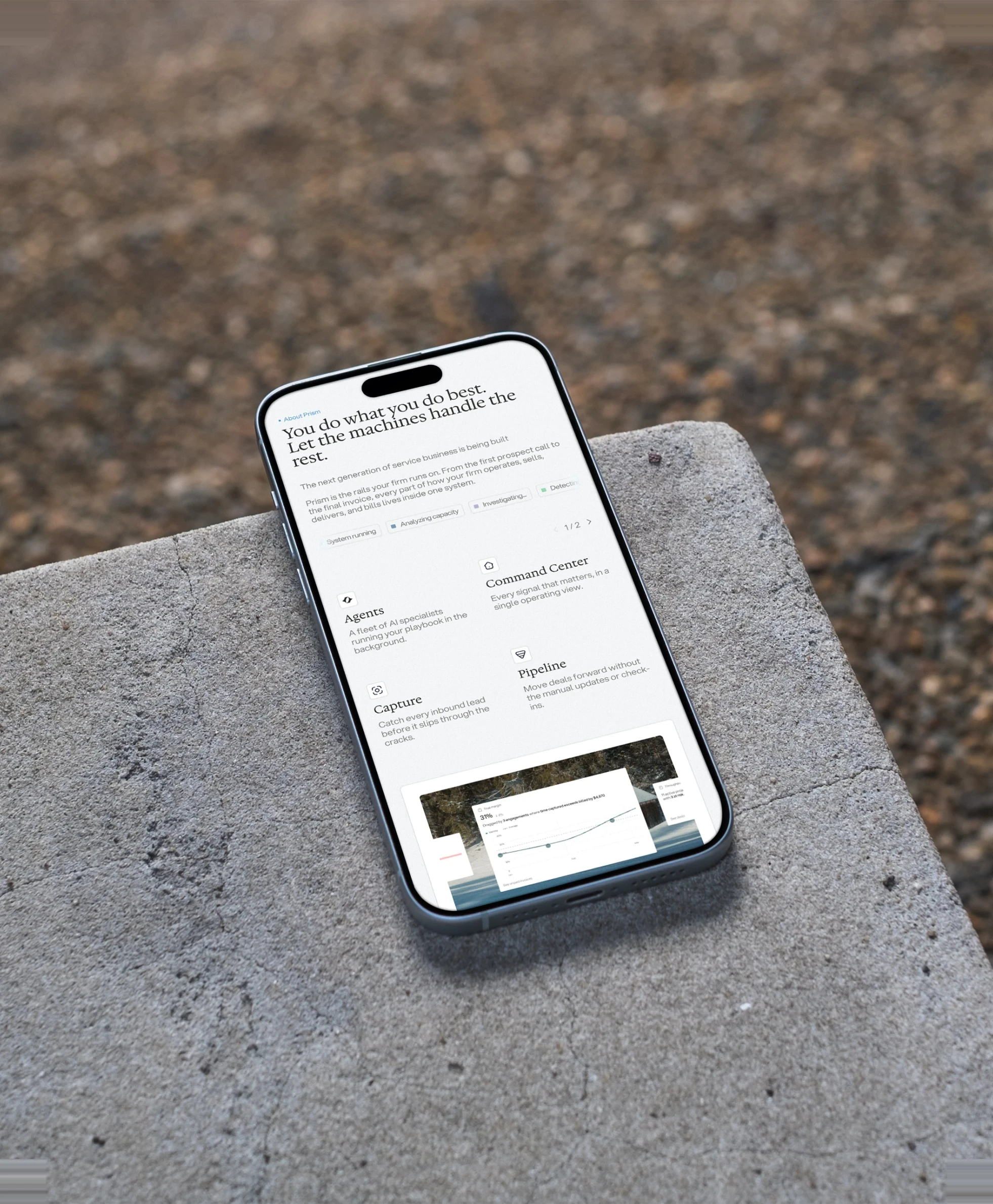
The identity was shaped alongside the product. We started by working out how owners, managers and employees each move through the platform, then built a language that could hold those different levels of information and action. Prism had to feel active and useful the moment someone opens it: what needs attention first, with clear paths into the detail when they want it. That principle shaped the brand as much as the screens.



Reflection
Prism is Refract’s first internal product, and it’s been great to build something end to end that we’re proud of.