LUMOS - Process breakdown
An overview of Refract’s engagement with Lumos, covering product strategy, task flows, interface design, the design system and design QA across the planning and buying experience, plus the visual revamp that brought the product in line with Lumos’ new brand.

Overview
Lumos had a working out-of-home platform, but the part campaign planners used to actually buy media was the oldest. Planners were building plans, choosing sites and chasing vendor pricing through an interface that hadn’t kept up with the way they work. Lumos had also just rebranded. The new identity is warmer and more playful than anything the product could carry, so the work was two things at once: rebuild how planners buy, and bring the interface up to the new brand.
Process
We used a three-phase process to modernise a legacy surface without breaking the workflow it already supported. Lumos already had a working platform, so we started there. We audited the existing planning and buying tool screen by screen, then spent time with the internal team working out why it behaved the way it did. What we learned shaped the product map, task flows, wireframes and interface direction. We then built out high-fidelity screens, a reusable component library and the specifications the engineering team built from.
 Define
- Product audit
- 2 weeks
- Internal interviews
- 3 weeks
- Workflow mapping
- 1 week
- Task flows
- 2 weeks
 Ideate
- Product map
- 3 weeks
- Moodboarding
- 1 week
- Low-fi design
- 6 weeks
- Design system
- 1 week
 Execute
- Hi-fi design
- 6 weeks
- Component library
- 2 weeks
- Design QA & handoff
- 2 weeks
- Build support
- Ongoing
Our strategy was to modernise the planning and buying experience without asking planners to relearn their job. They needed to build a plan, compare sites across budgets and formats, get pricing back from vendors, and approve with confidence before the campaign date.
This led to one continuous workflow instead of a set of disconnected screens. A plan carries its client, advertiser, budget, audience and site selection all the way through briefing, response and approval, so nothing gets re-keyed and every decision keeps its context. Behind the scenes we paired a versioned brief model with a shared component library, which gives the team room to extend the product without the interface drifting apart.
Problem
The platform worked, but the buying side had aged badly. Planners were comparing hundreds of sites across budgets, formats and regions through an interface built for a smaller, simpler business. It was slow to scan, easy to mis-key, and it never made clear how a change to one site moved the rest of the plan.
The new experience had to hold three things at once:
Data density...
... for planners comparing hundreds of sites, formats and schedules in a single sitting
Commercial precision...
... for the budgets, rates and vendor responses that make up a plan
Continuity...
... for teams adopting a new interface mid-campaign
We needed to modernise without slowing the buy.
Early sessions showed the real constraint was continuity. Planners work to campaign dates that don’t move, so the new experience had to stay recognisable enough to pick up mid-campaign while losing the parts that slowed them down. The surface also had to hold different kinds of work at once. Site selection and budgets needed dense, scannable tables. Briefing and vendor responses needed guided input. And every plan had to show what it was delivering against the audience it was bought for.
Discovery
Discovery started inside the product Lumos had already built, then went deep with the team who ran it every day.
Product audit: starting inside what already existed
Lumos already had a working platform, so discovery started there rather than on a blank page. We audited the planning and buying tool end to end, every screen, state and workflow, to understand what had been built, where planners dropped out, and which parts were carrying the most load.
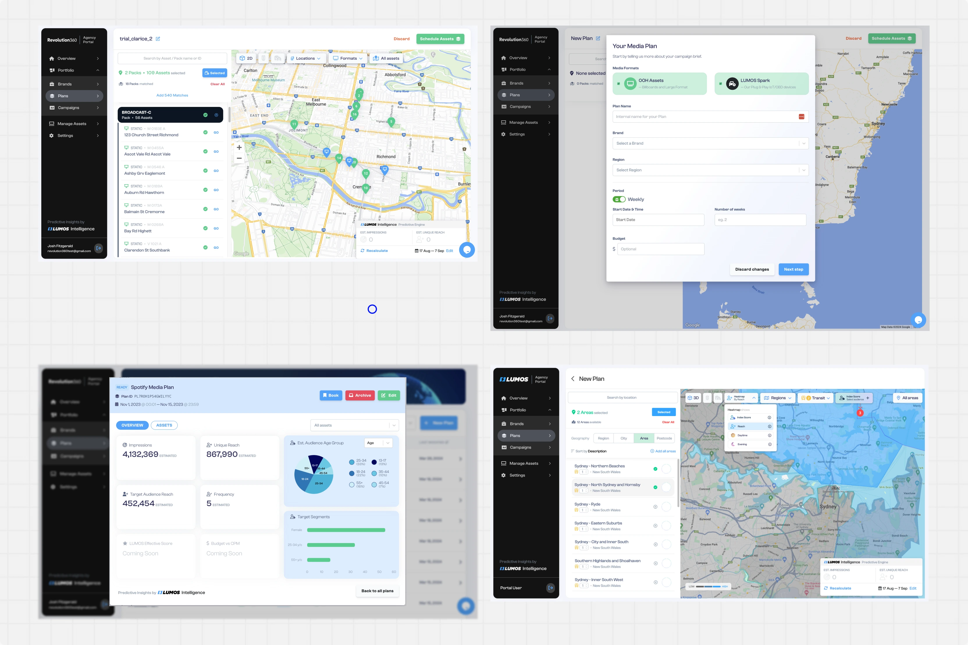
That gave us a shared, evidence-based picture of the product as it actually was, and a backlog of friction points we could test against the internal team’s own experience.
Internal interviews: the knowledge that wasn’t written down
We then spent a lot of time with the internal team. Planners, traders, engineers and the people fielding client questions all helped us work out why the product behaved the way it did, and which constraints were real.

Prioritise the campaign planner, without excluding everyone else.
The product needed to make plan state, budget headroom and outstanding vendor responses obvious at a glance.

Design for the way a plan actually gets built.
Someone might arrive to set up a plan, filter sites, brief a vendor, chase a response, or compare budget options.

Make the effect of every change visible.
The product needed to show what a plan is delivering, what it costs, and what is still outstanding at every step.
Task flows: the whole journey first, then the detail
The audit told us where the old product broke down and the interviews told us why, so the flows started from evidence rather than a blank page. We mapped the campaign lifecycle end to end before touching a single screen, then drilled into each step and redrew it at a lower level. The flows went through a lot of rounds, and almost every version we put in front of the team came back with something we had assumed wrong.
The wide view: intent to live campaign
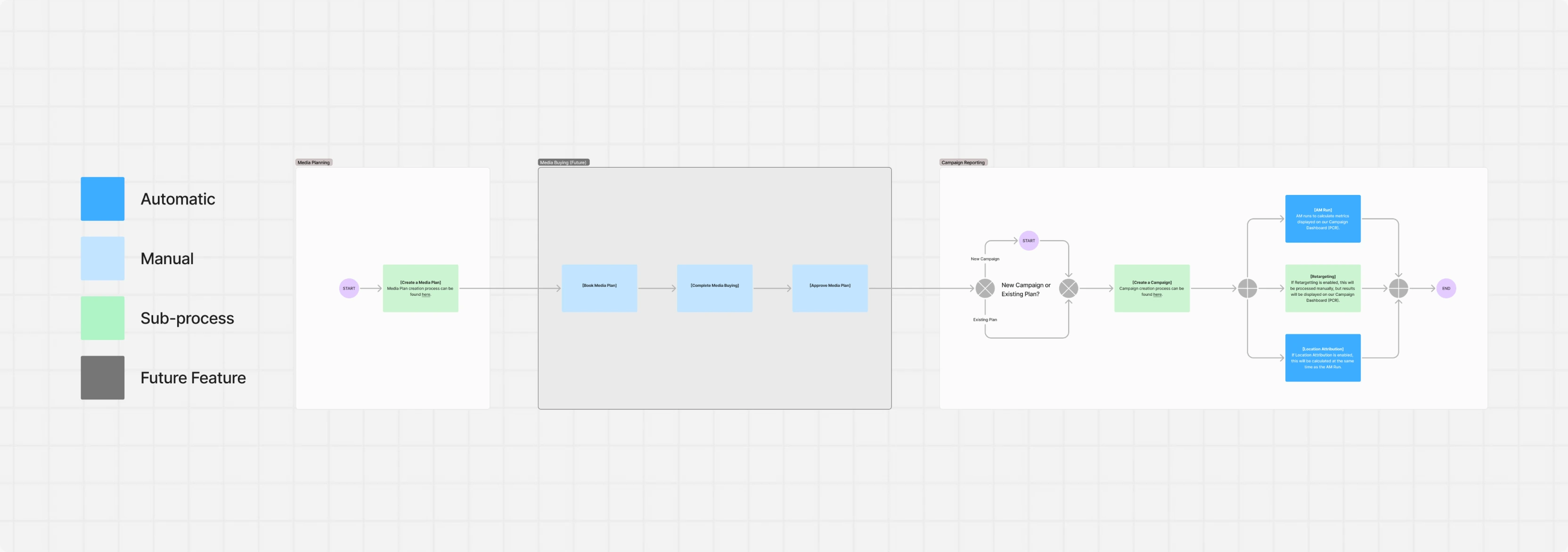
The first pass, deliberately coarse. It sets the spine of the product, from a planner needing to book a campaign through to the plan going live, and it is the version everything else hangs off. Where planners dropped out in the audit decided which steps earned a box, and the re-optimise loop came straight out of the interviews.
Drilling in: briefing and vendor responses
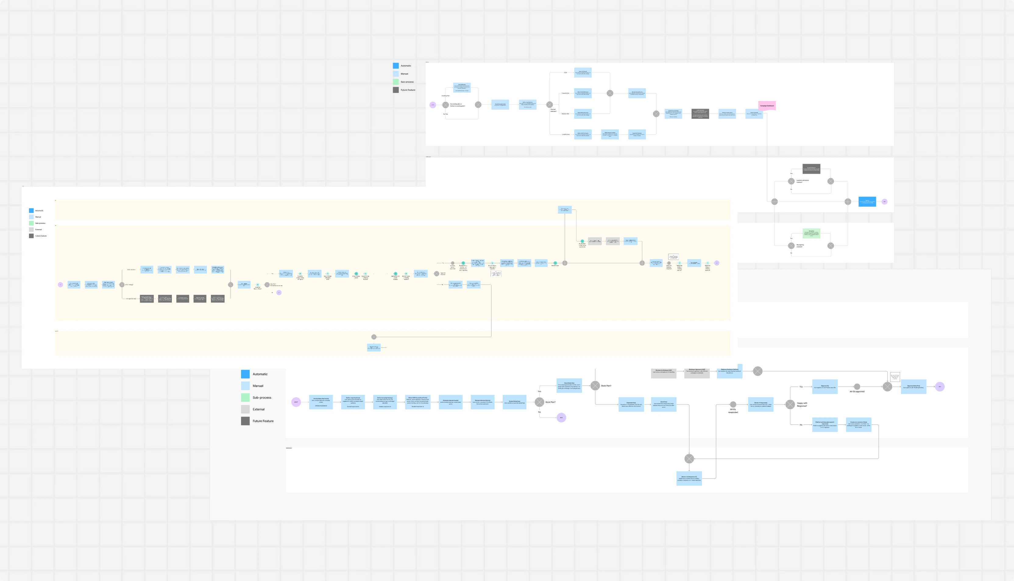
One step from the wide view, opened up. Briefing held the most states and the most disagreement, so this is where we drew a lot of flows. And by a lot of flows, we mean a lot of flows. Somewhere past v12 the file names gave up. There’s a board called “briefing flow FINAL” and there are four boards after it. By the time we put a soft cap on negotiation rounds in the product, we knew the feeling.
Low-fi design
Low-fidelity design turned the audit and interview findings into a working structure before visual styling began. We mapped the key journeys across plan setup, site selection, briefing, vendor responses and approval. That meant deciding what each role needed to see first, what belonged behind a panel or modal, and how screens connect. It covered plan setup, the site table, filtering and map view, brief creation, vendor responses, and budget comparison.
The wireframes established a flexible screen system.
- Plan views that carry one campaign through overview, sites, schedule and strategy
- Site tables for selection, filtering, packs and bulk actions
- Briefing flows for sending and tracking vendor briefs
- Response and comparison views for pricing, revisions and versions
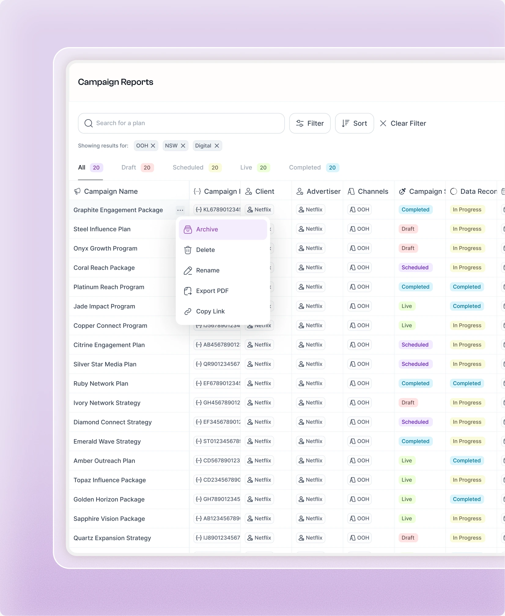
- Management screens for clients, users, assets and reporting
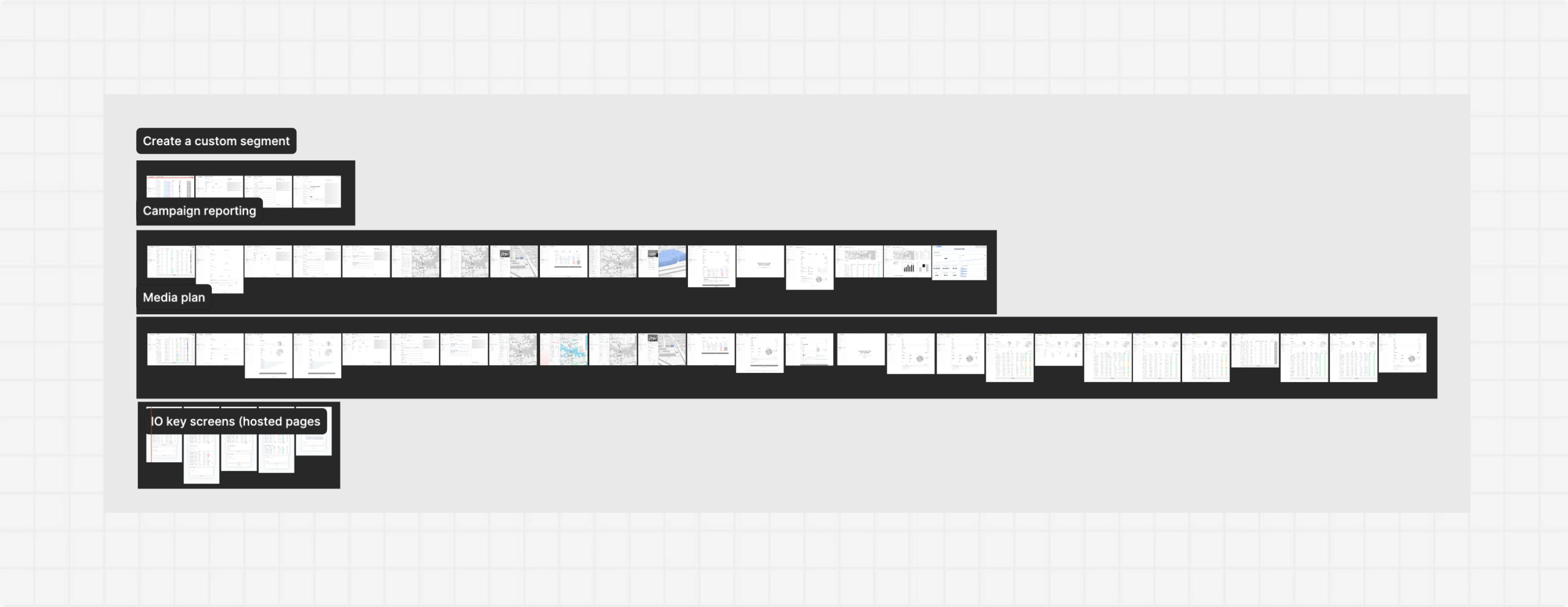
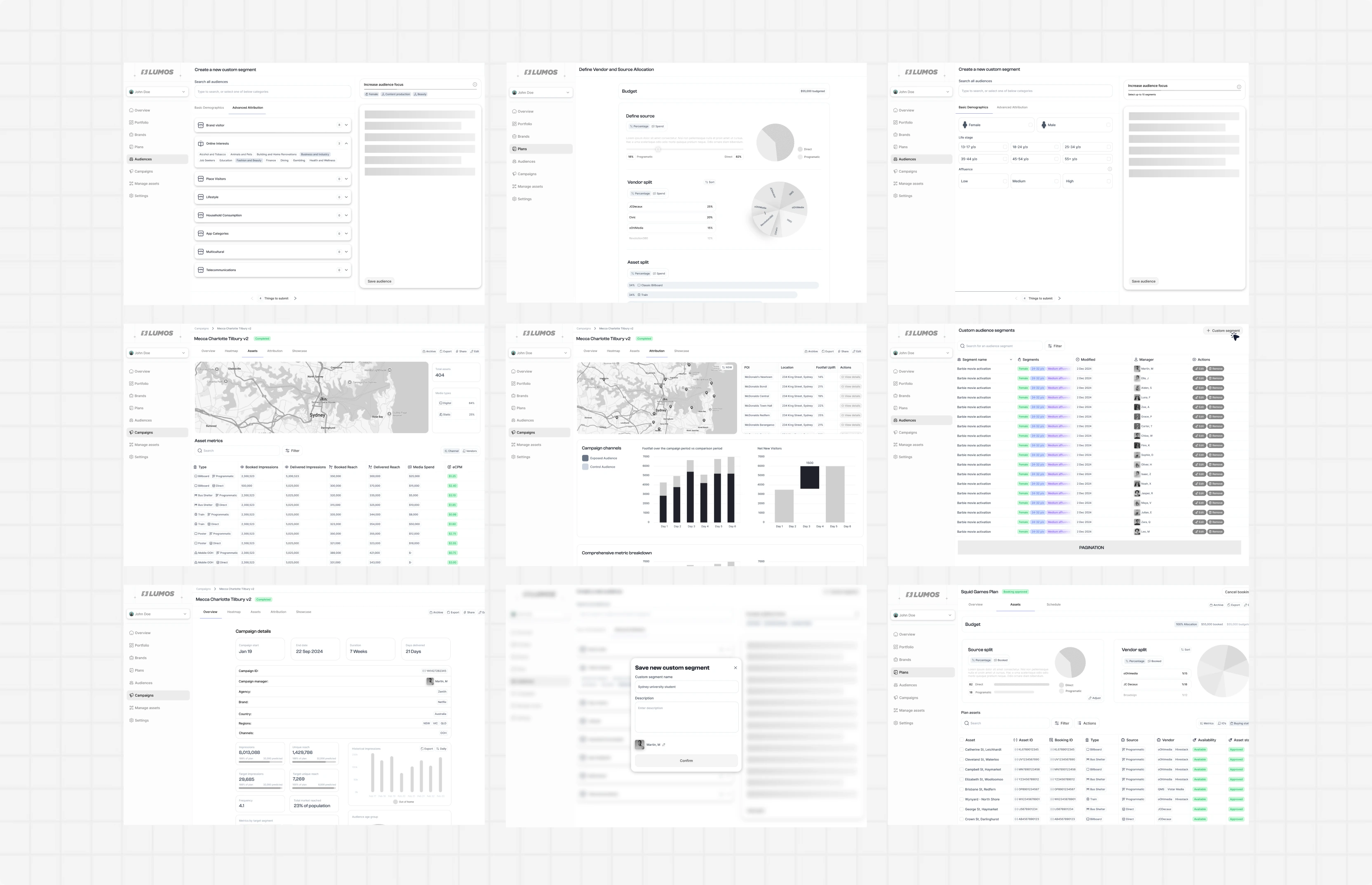
We used this phase to test structure and hierarchy early. Feedback helped simplify the primary navigation, surface plan status earlier, keep budget totals visible while selecting sites, and make version state obvious on every screen that shows a number.
Hi-fi design
High-fidelity design is where the new brand and the structure came together. We worked out how much of the rebrand the product could carry, then applied the result across the full screen set, resolving density, hierarchy and state as we went. We designed plan setup, plan overview, site and map views, briefing, vendor responses and comparison screens end to end. That included table behaviour, filtering, bulk selection, side panels, empty and loading states, and the responsive rules the build would rely on.
Translating the brand
Lumos had just come out of a brand redesign, so before designing anything we spent time inside the new identity. We went through the guidelines, the marketing site and the assets the team had already built, working out what made it feel playful and lively, and which parts of that could survive in a product. Then we translated it. The question was how much of that brand a dense, data-heavy product can actually carry. Too little and the revamp is invisible. Too much and colour starts competing with the numbers planners read all day.
What we landed on
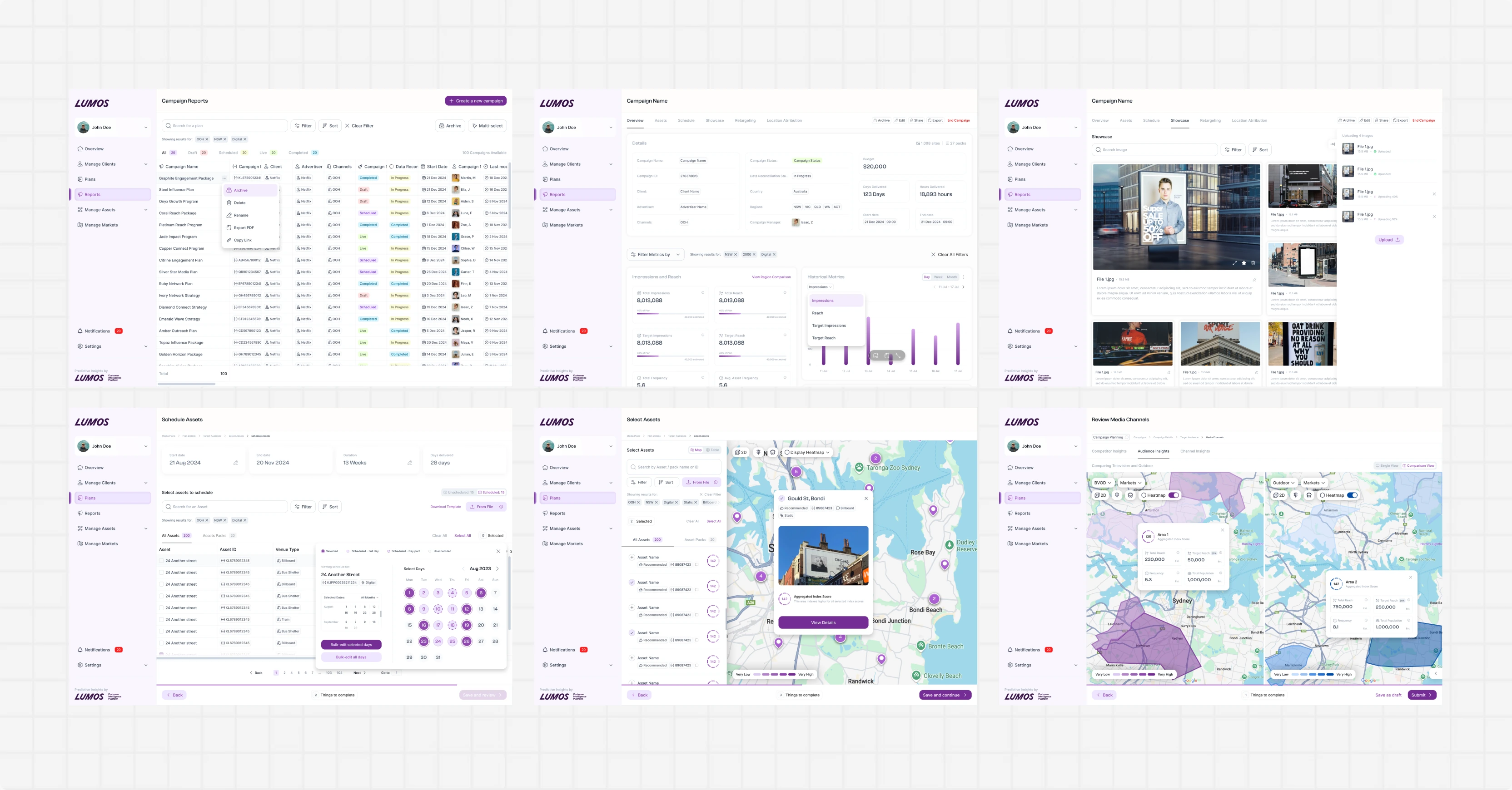
- Warm neutral backgrounds from the new palette, so the product feels like the brand rather than a spreadsheet
- Purple reserved for state, action and selection, never for decoration
- Brand personality concentrated in navigation, empty states, onboarding and success moments
- Dense tables kept deliberately quiet, so long site lists stay scannable under load
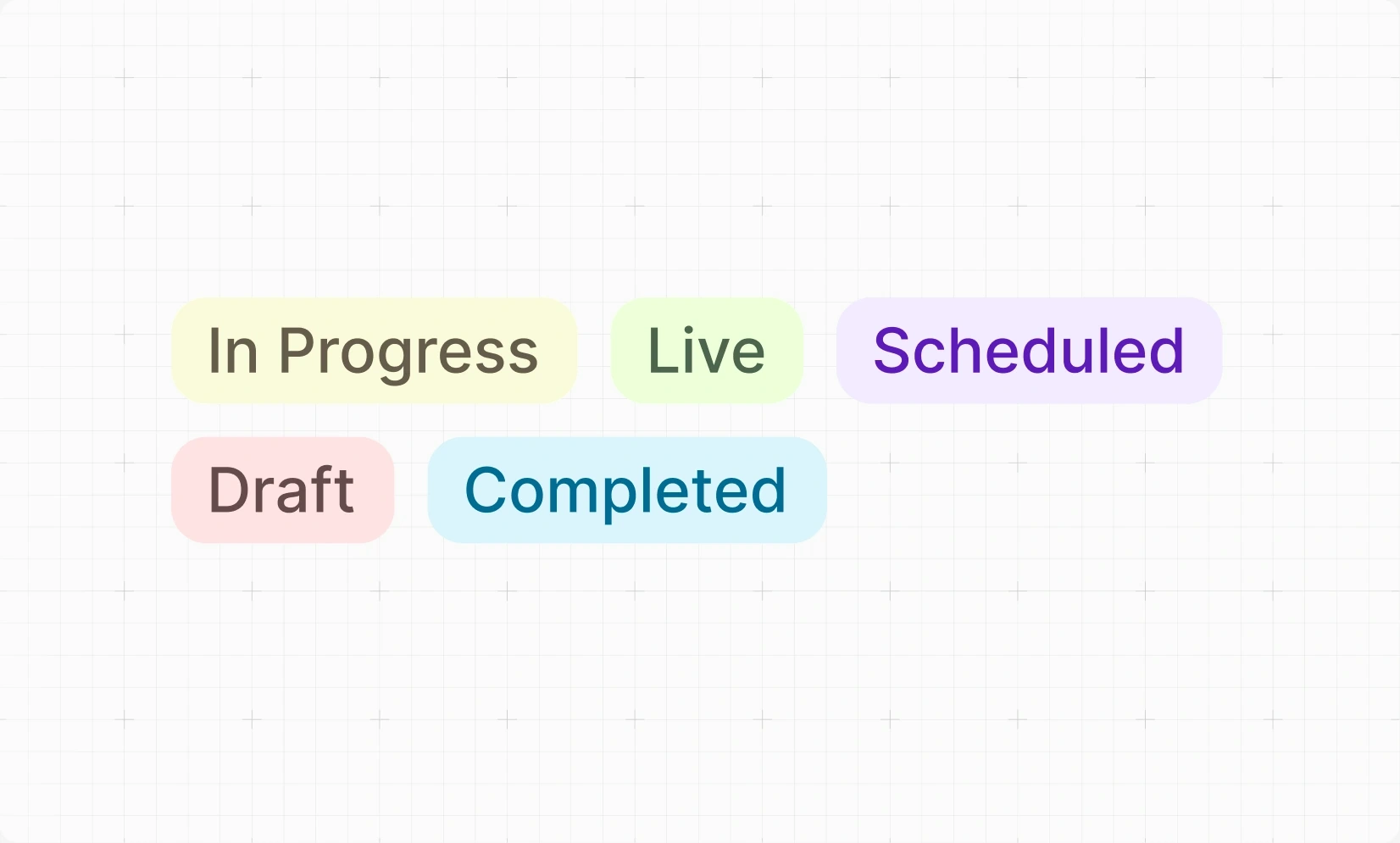
- Clear, consistent status language across plans, briefs and versions
- A component library covering tables, filters, modals, side panels, and empty and loading states
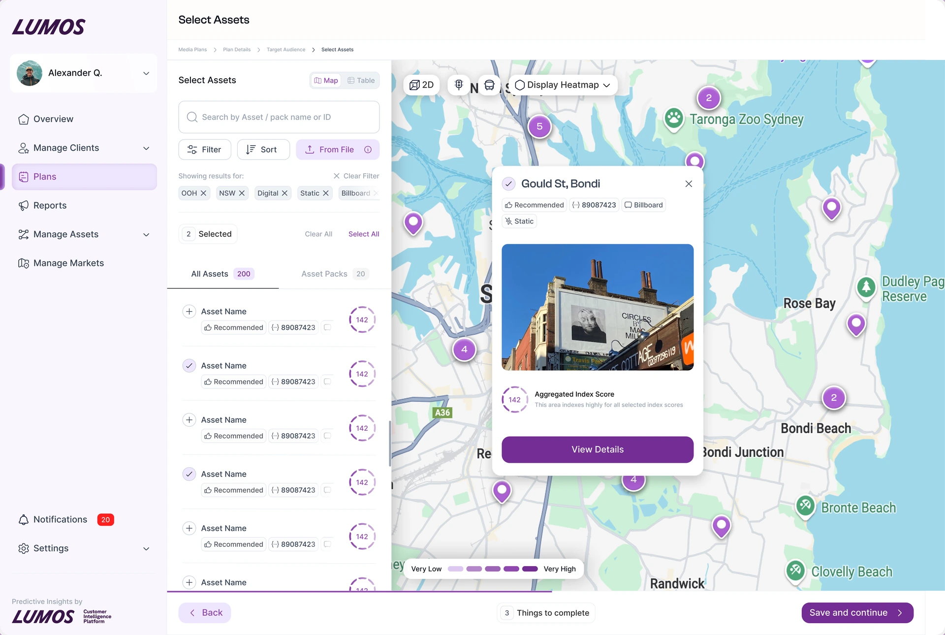
Choosing sites without leaving the map
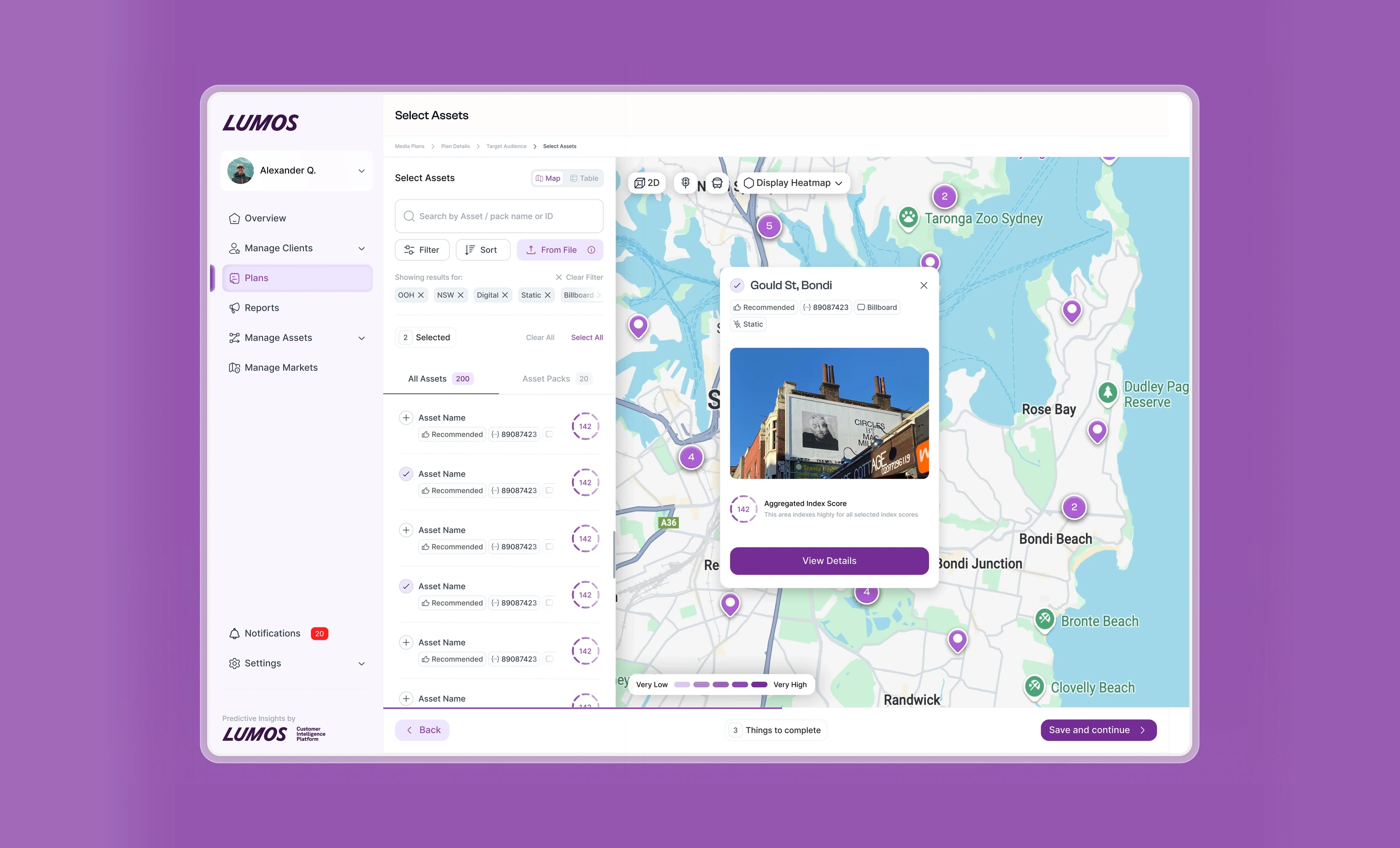
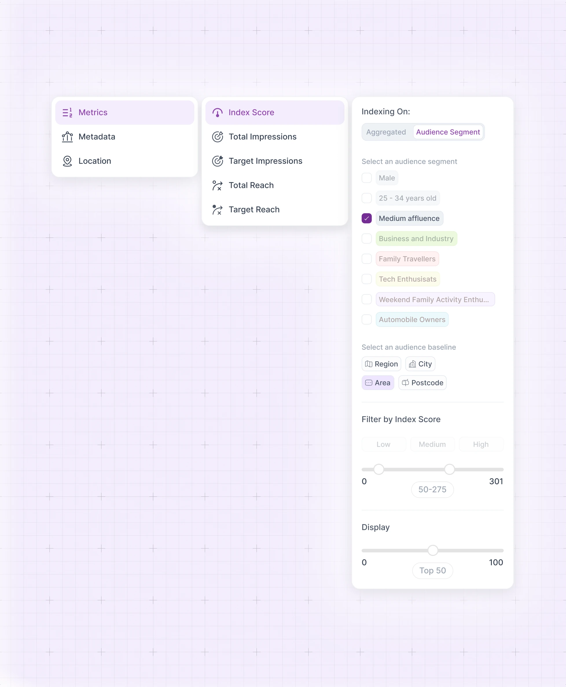
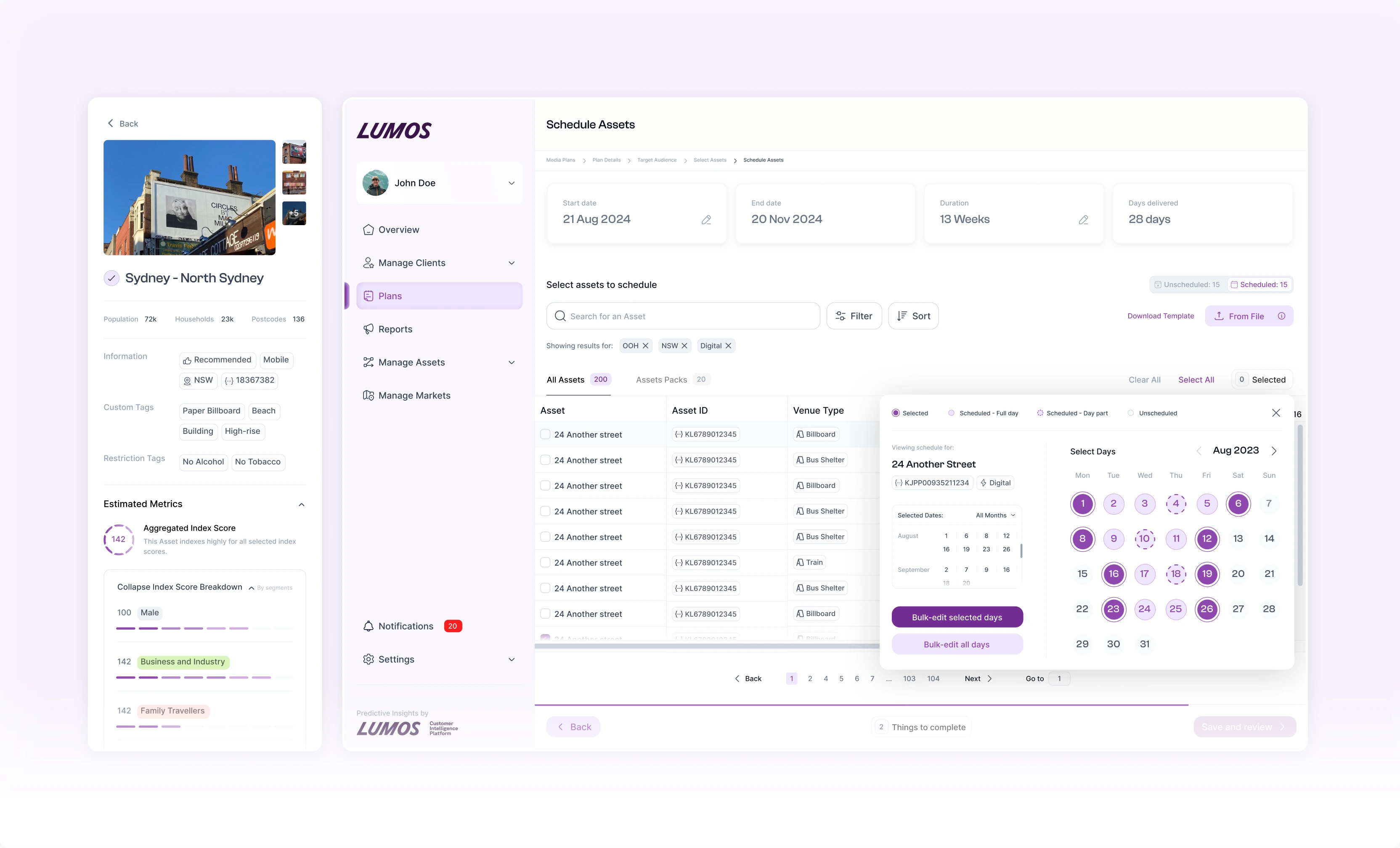
Selection is where planners spend the most time, so it got the most attention. Filters, the asset list and the map stay on one screen, and every asset carries its index score so a planner can see how well it fits the audience before adding it. The heatmap answers the question they actually ask, which is where the audience is dense rather than where the sites happen to be.
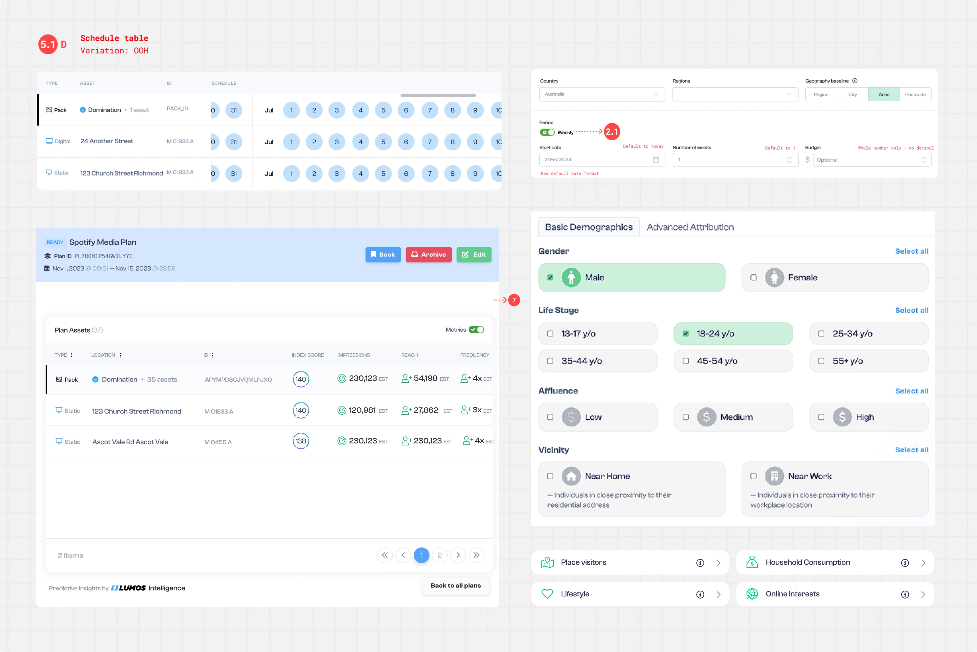
Making the audience legible
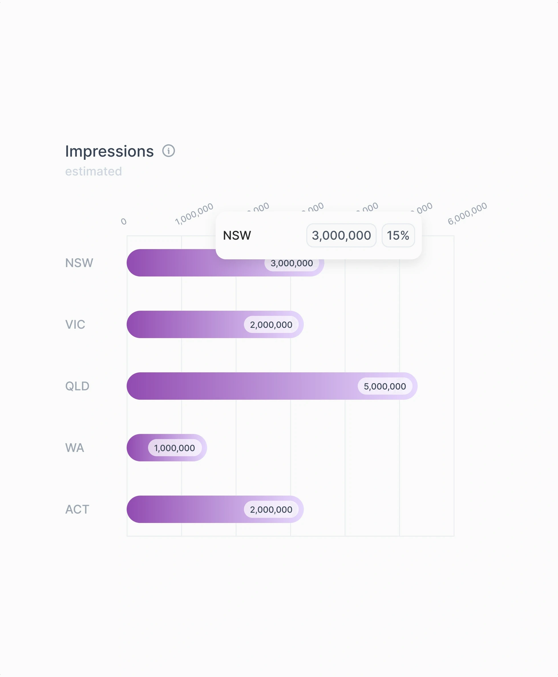
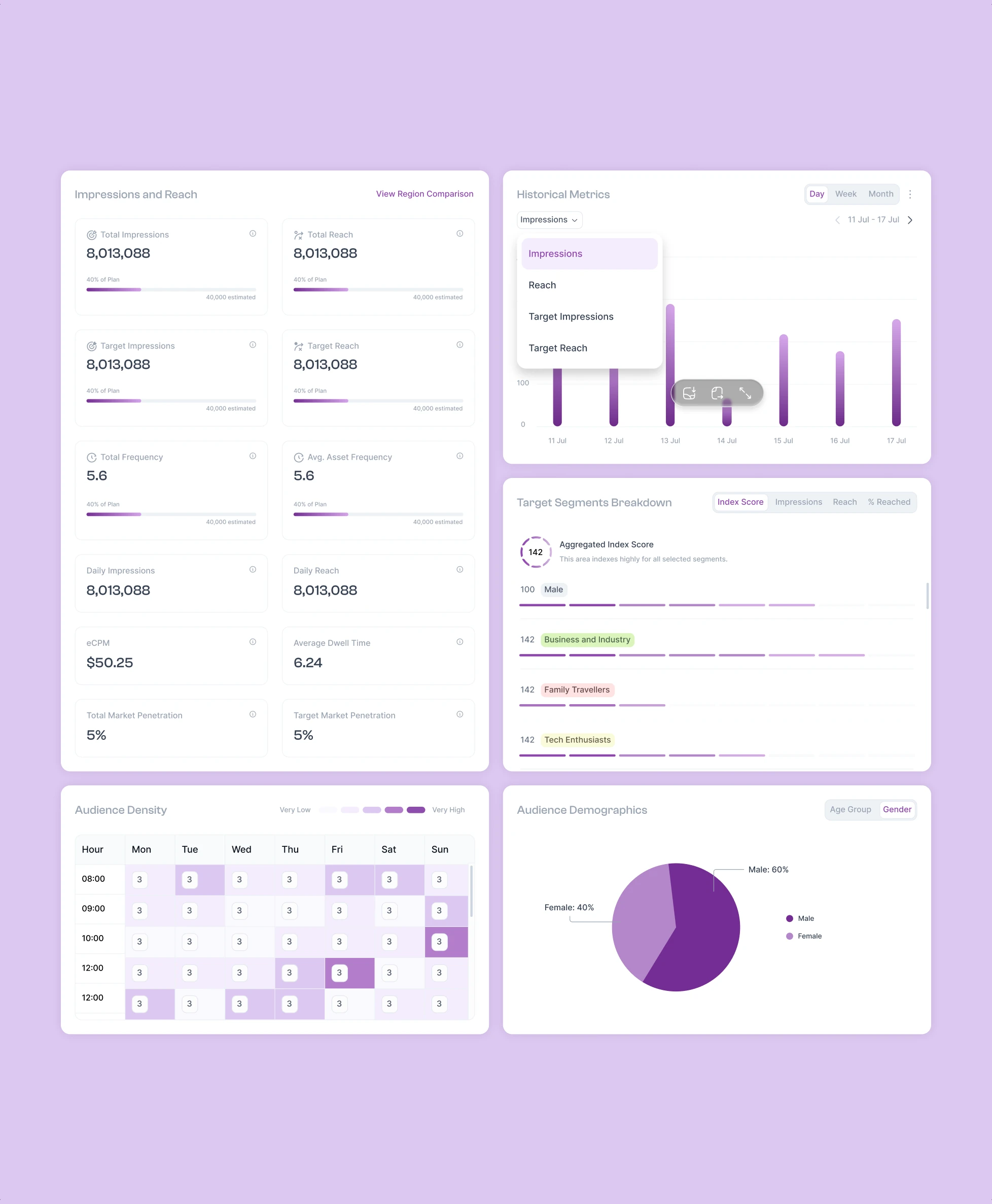
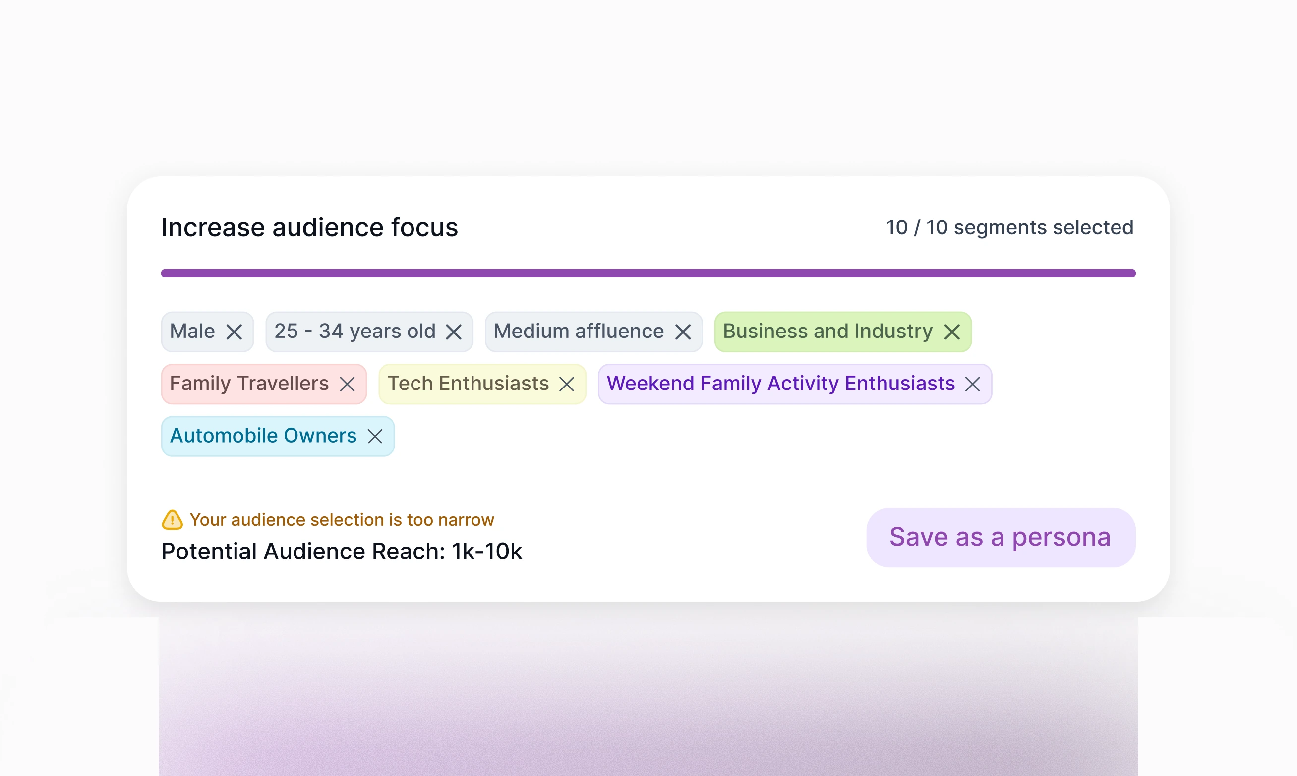
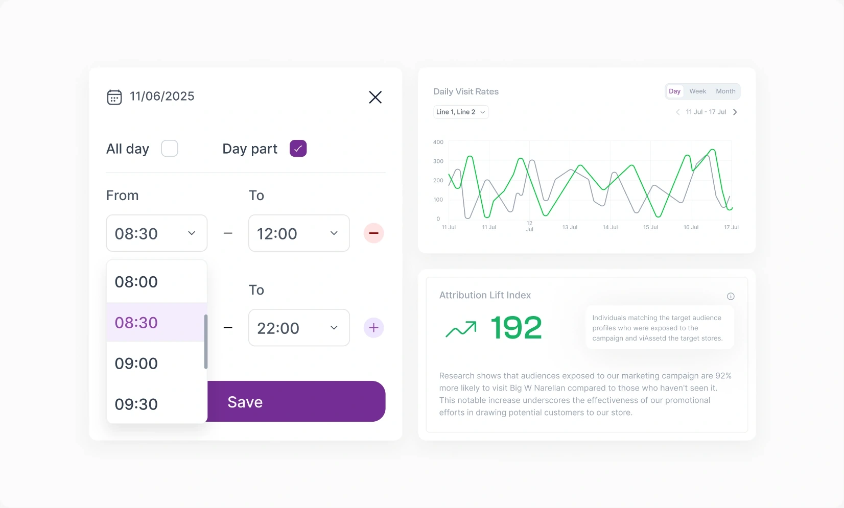
Once sites are on the plan, the numbers have to explain themselves. Impressions and reach sit next to the segments driving them, and the index score runs through every view so it always means the same thing. We added guardrails too. Narrow a segment too far and the product says so, and tells you what reach you have left before you commit.
Comparing channels, then proving it worked
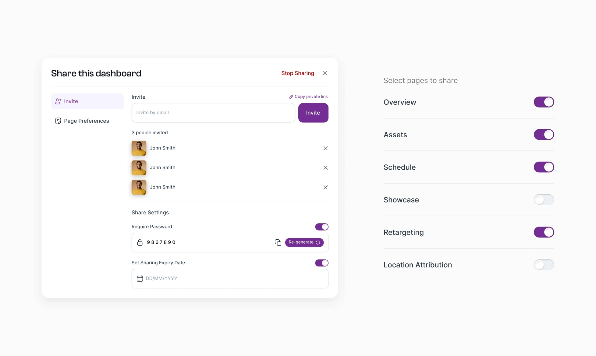
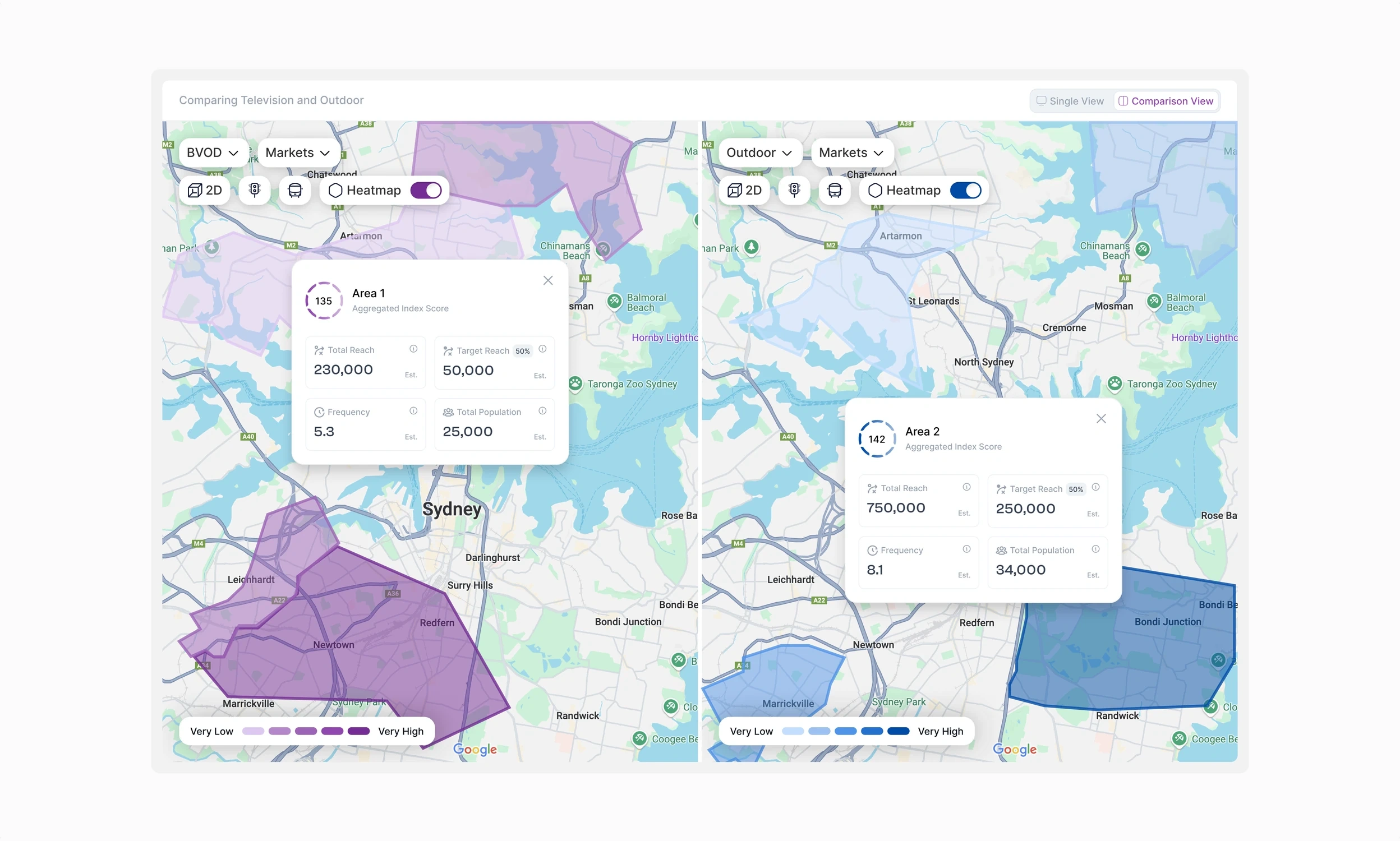
The last stretch covers the parts that used to happen somewhere else. Planners can put outdoor next to another channel and compare reach on the same basis, schedule assets down to the day part, and pull a report without exporting anything to a spreadsheet. Same components throughout, so the dense screens still feel like one product.
Design System
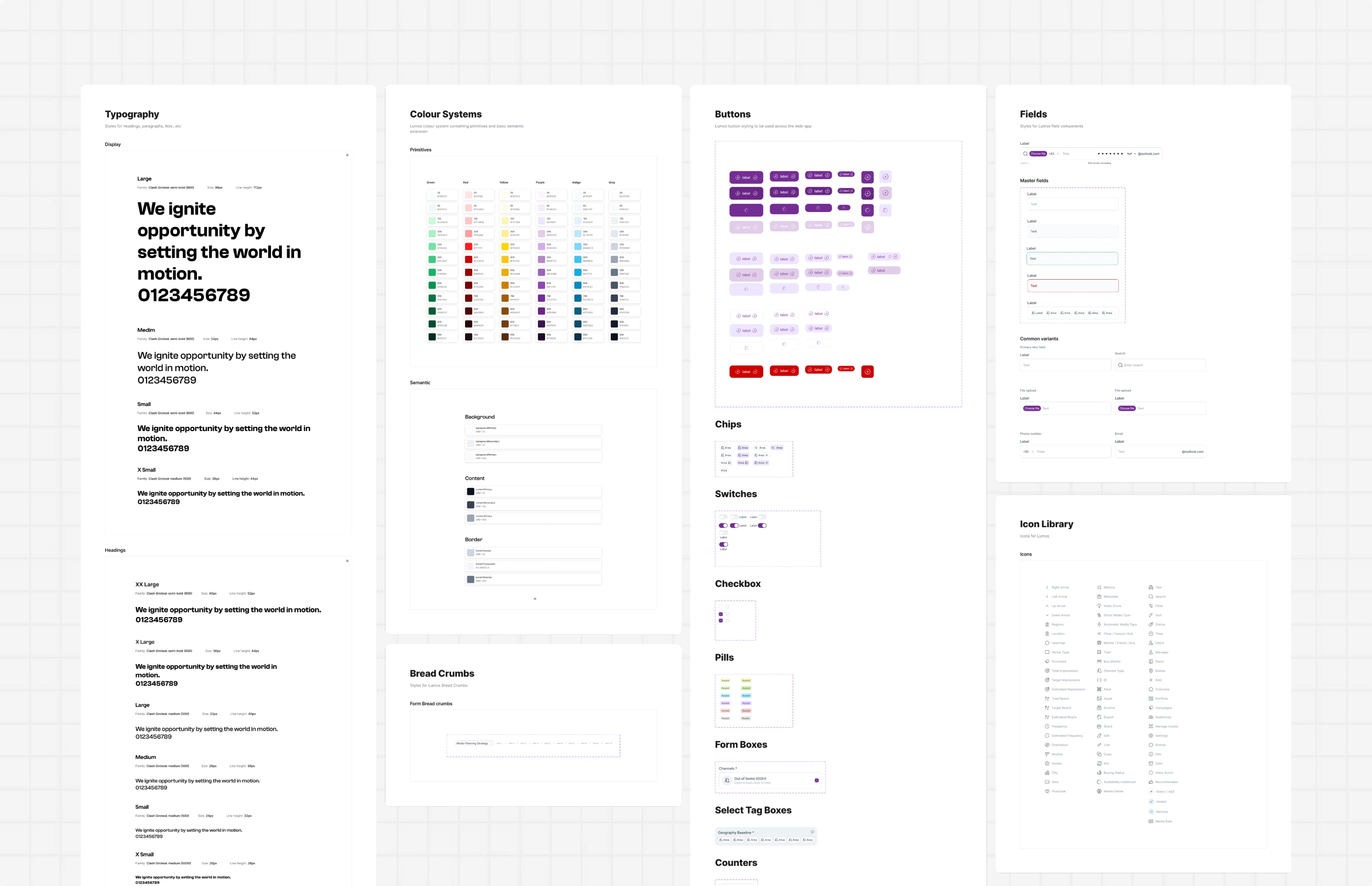
To keep a large, data-dense product consistent, we built a design system that could scale across every module and carry the new brand properly. It defines the interface language: typography, spacing, grids, colour and state, buttons, inputs, tables, cards, navigation, side panels and interactive states. The palette comes from the rebrand, with warm neutrals doing the heavy lifting and purple reserved for state and action, so the identity is visible without making the data harder to read.
We pressure-tested the high-fidelity screens with the Lumos team, refining table density, status language, and how far the new brand could push into the working surface before it started competing with the data.
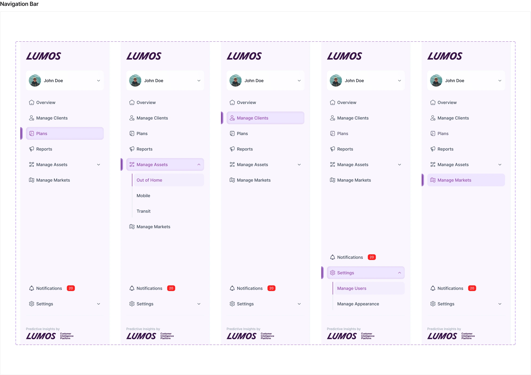
Navigation design
We designed the navigation around the plan rather than the underlying system. The primary navigation keeps overview, clients, plans, reports and assets one click away, while the plan itself carries its own tabs for overview, sites, schedule and strategy. It is also where the new brand is most visible. The shell frames the work and carries the personality, so the tables underneath can stay quiet.