Iterating on our own identity
The Refract website and identity are an always evolving entity, with the only true constant being the name and, for now, the logo. Four identities in as many redesigns, and what each one was reaching for.
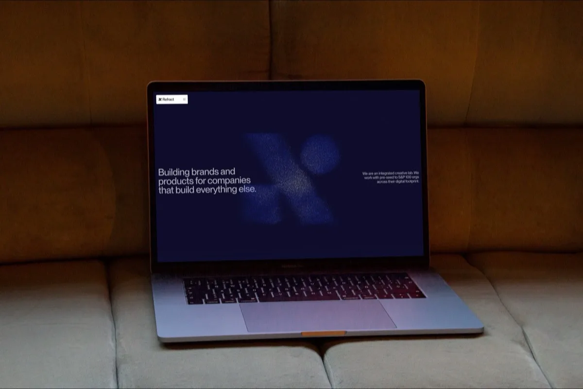
The visual identity of Refract is an interesting one. As a group of designers, we always have a new style, or something new we want to try, and of course nothing is ever finished. The Refract website and identity are an always evolving entity, with the only true constant being the name and (for now) the logo.
We’ve gone from dark mode (orange) to dark mode (blue) with stops of dark mode (black) and full light mode along the way. We usually anchor around PP Neue Montreal as our basis, as it’s a studio-wide favourite.
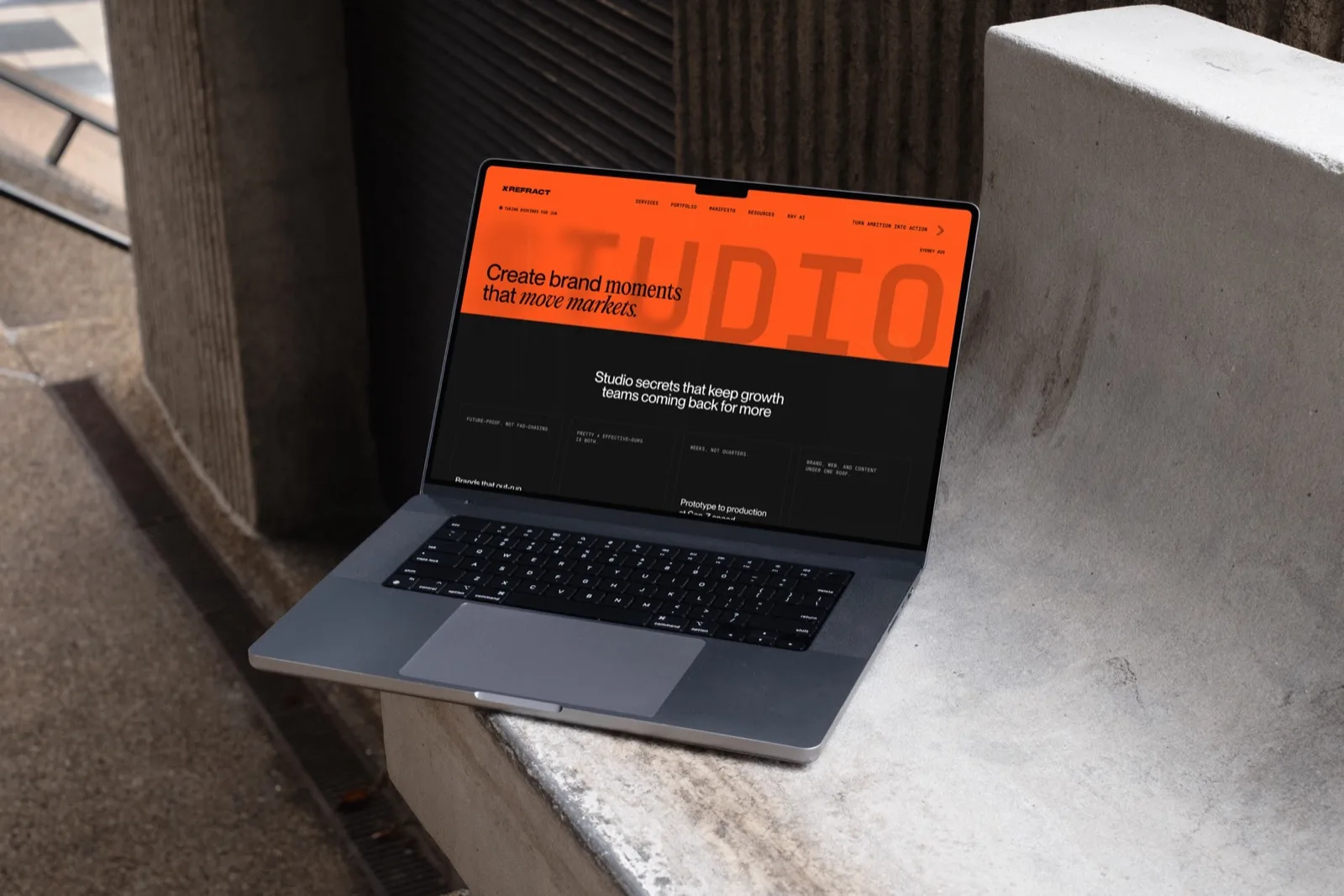
When I started at Refract, we were in an orange phase, which carried along for a few website redesigns, until we pivoted away into a light mode spec.
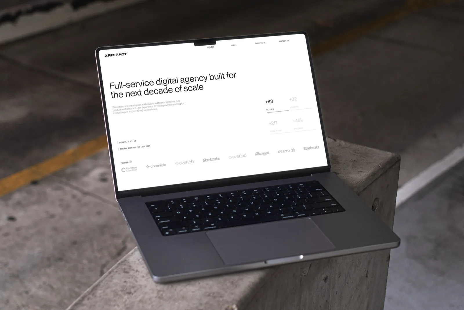
One of my personal favourites, the light mode, was great, but lost its excitement faster than we had hoped.
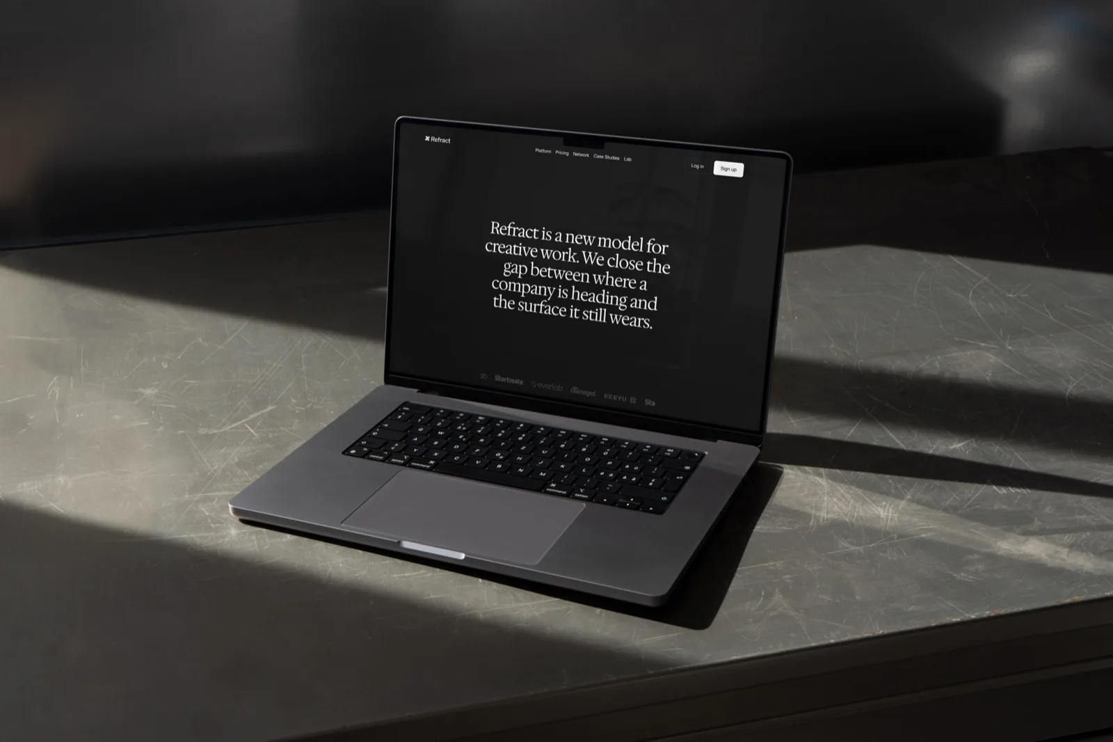
Another ultra-clean concept, created around a time when we were fully focused on building digital tooling, both for clients and for ourselves, and wanted this to reflect in the identity.
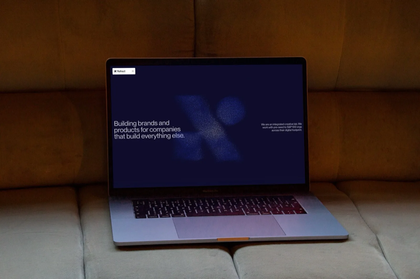
What you see now is our latest, a balance between light and dark, with blue highlights and interactive elements. The particles system on the homepage adds a point of interest, followed by crisp clean lines on the rest of the site. Merch in this style will be a fun one I’m sure.
Long story short, as designers and perfectionists, we always find a way to improve or adapt things that shape how we want to be seen by the world. Especially something within arm’s reach, such as our own web presence.
Written on by