
Resilience in motion, made visible.
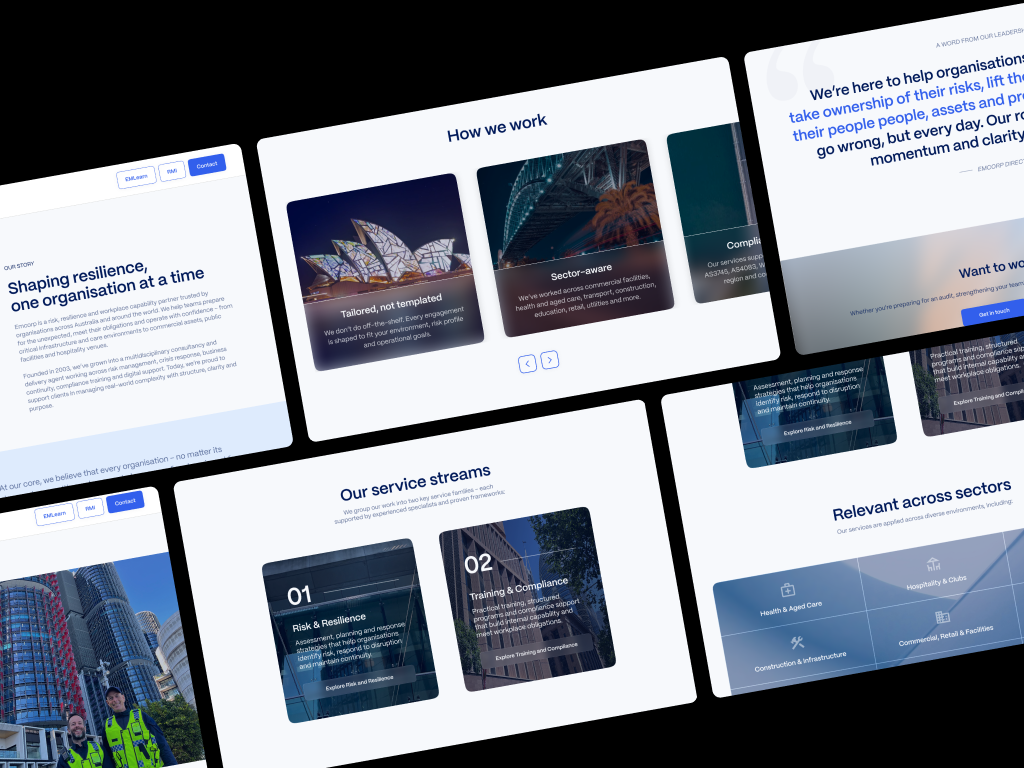
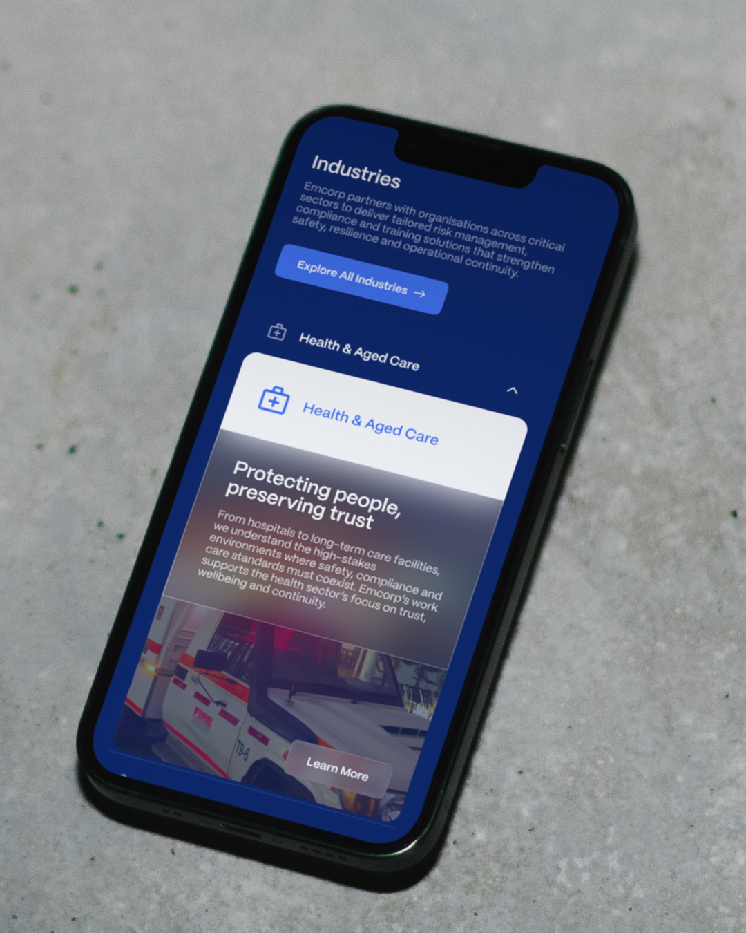
We redefined Emcorp’s brand for a shifting risk landscape – modern identity, motion principles and a digital-ready system that communicates awareness, preparedness and response with clarity and momentum.
Emcorp leads where risk and resilience meet. The brief: evolve the brand to match that leadership – future-focused, digitally fluent and unmistakably aligned to the organisation’s daily commitment to anticipate, prepare and respond.
- Identity system: A hexagon-led geometry expresses structure and interconnection; open forms signal adaptability; balanced weight and spacing convey assured strength.
- Design language: Clear rules for colour, typography, grid and motion – “resilience in motion” – so information reads fast and complex ideas stay legible.
- Visual storytelling: Photography and illustration themes centre people, spaces, coordination and critical paths.
- Crisp voice and messaging: Direct, expert, calm under pressure – framing services as ongoing capability, not one-off interventions.
- Digital readiness: Tokenised styles for web and social media, accessibility-first contrast and components that scale from online destinations to digital collateral.
Emcorp’s rebrand redefined professionalism – a modern visual language built on precision, restraint and quiet authority. It signals trust without saying a word, uniting the company’s risk, compliance and resilience services under one strong identity.
The refreshed brand gives Emcorp the credibility and consistency to operate globally – confident, contemporary and built to endure.


