
Repositioning Managed as the true OS for property payments.
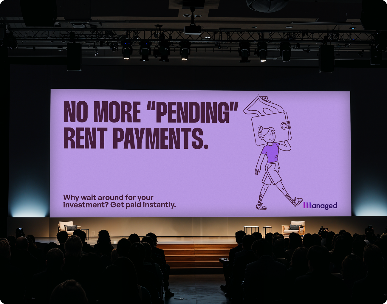
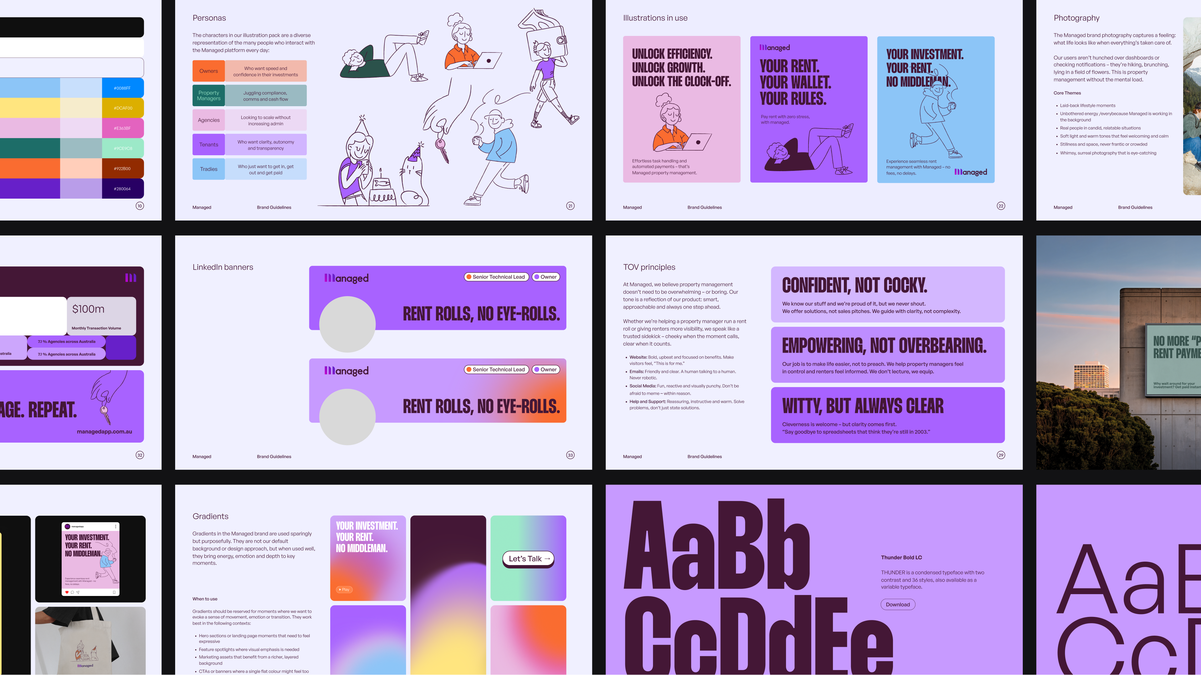
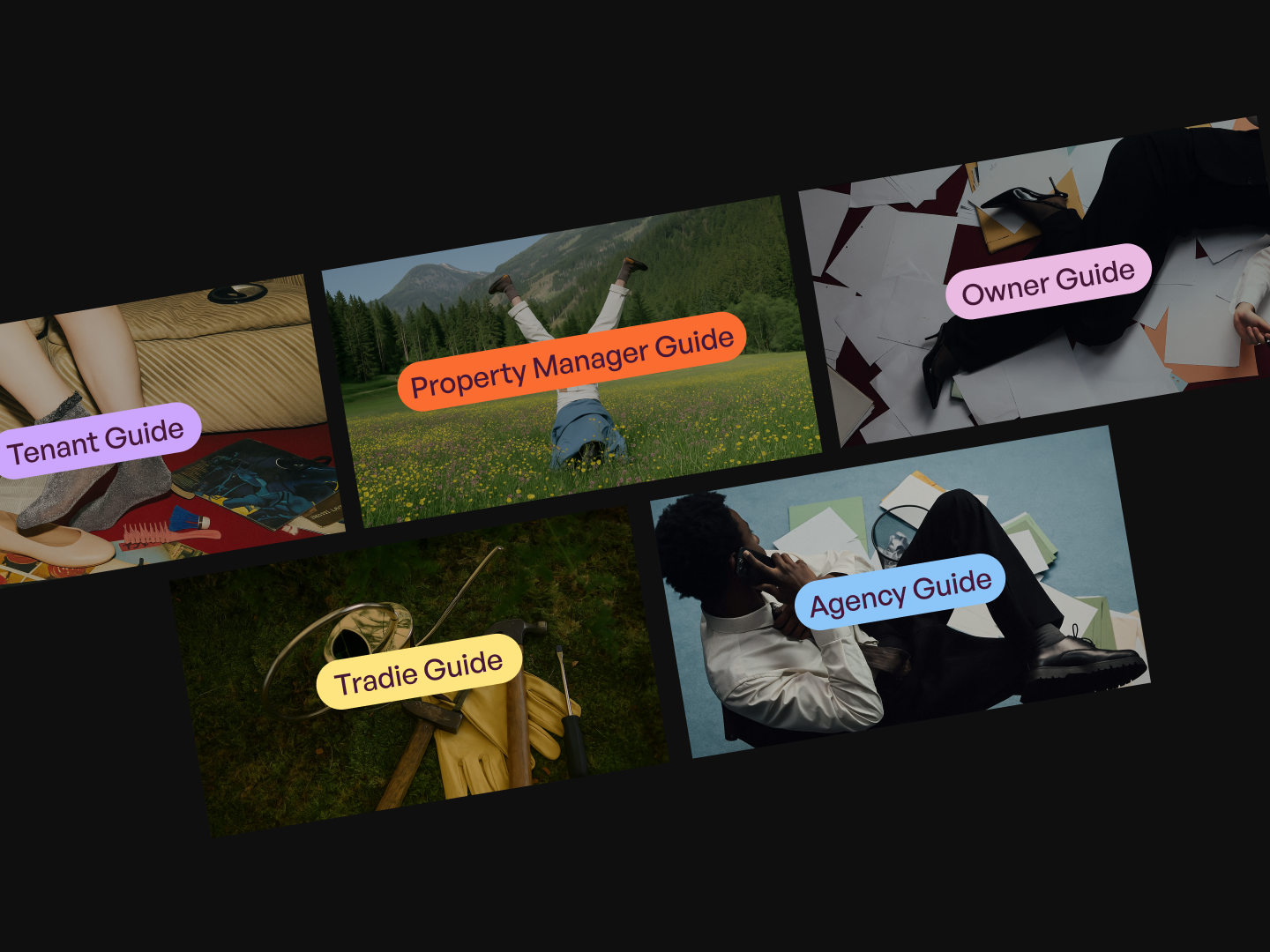
A ground-up rebrand turned Managed into a stand-out category presence: a sharper logo, bold fintech-meets-prop-tech palette, clear human photography and a voice that speaks to their innovative mission – all packed into a design system the team can deploy in minutes.
Managed already let property managers ditch the dusty trust-account playbook and keep rent flowing instantly and securely, but the brand still had its baby teeth. With growth accelerating, the team needed an identity that matched its promise of control in human hands and could flex across product, social and out-of-home.
- Positioning and narrative: Re-aligned the brand story around the value of instant, trust-free payments and clear compliance.
- Identity refresh: Refined the word-mark, optimised spacing and expanded the colour palette for stronger recall across every touch-point.
- Visual language system: Defined cohesive and original illustration, photography and iconography styles that express transparency, efficiency and human connection.
- Voice and messaging: Reconfigured headlines, value props and microcopy in a clear, confident tone focused on outcomes, not features.
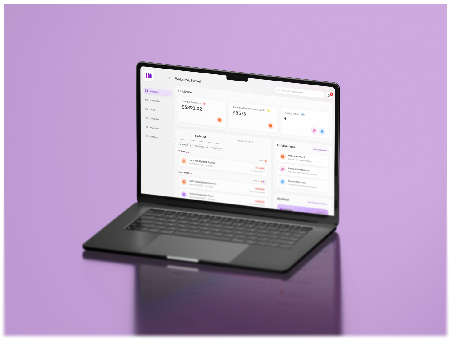
- Operational toolkit: Delivered a component-based design system with ready-to-ship templates covering social, OOH and product surfaces – so the team can launch on-brand assets in minutes.
Managed’s brand overhaul turned complexity into clarity – a unified identity for a fast-scaling property-tech company reshaping the way payments, compliance and communication flow.
The result – a confident visual and verbal system that mirrors the product’s reliability and growth. Clean, credible and built for trust, the new brand now works across every screen and partner touchpoint.

