Saunday
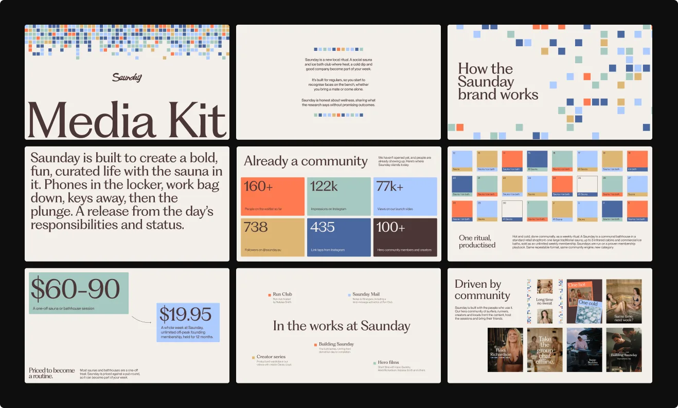
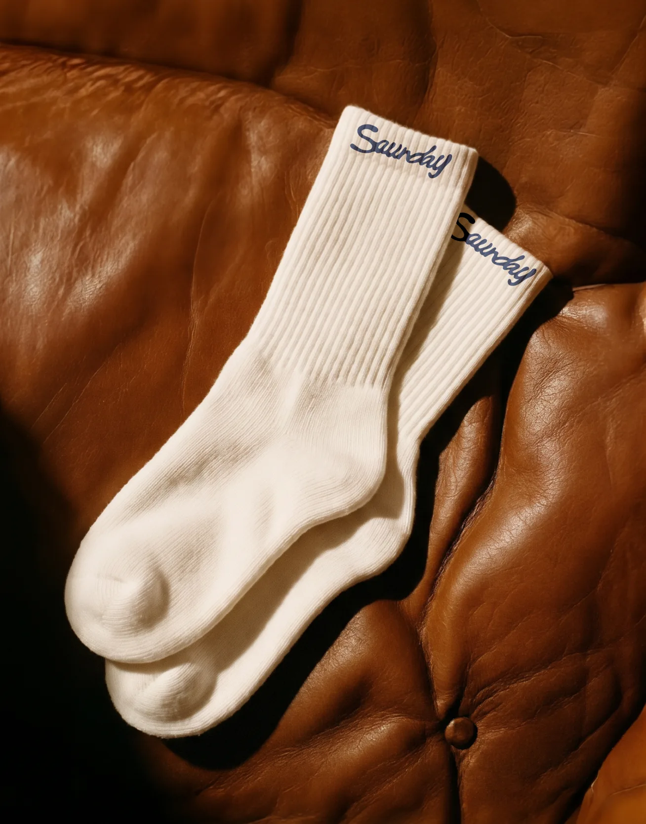
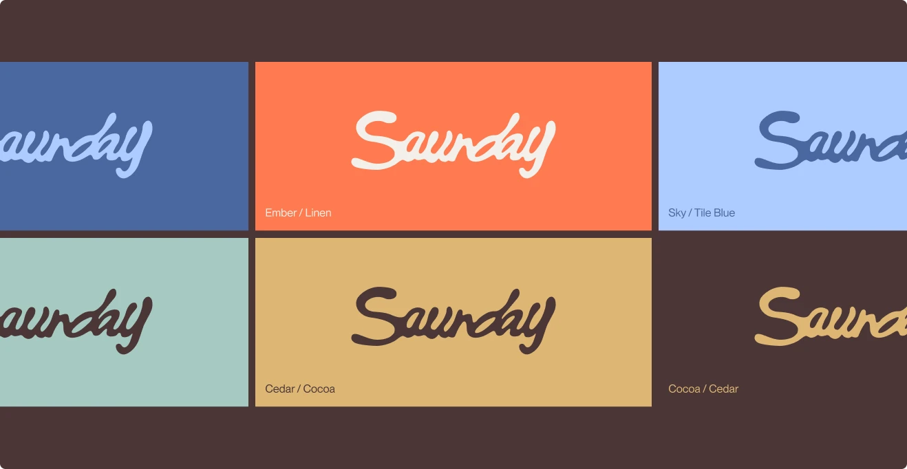
Saunday is a social sauna and ice bath club in Sydney, opening its first location in Narrabeen. We built the brand from the ground up: a script wordmark, a tile-mosaic system borrowed from the walls, a warm seven-colour palette and the launch campaign, all made to make the sauna feel like part of your week rather than a wellness event.
The brief
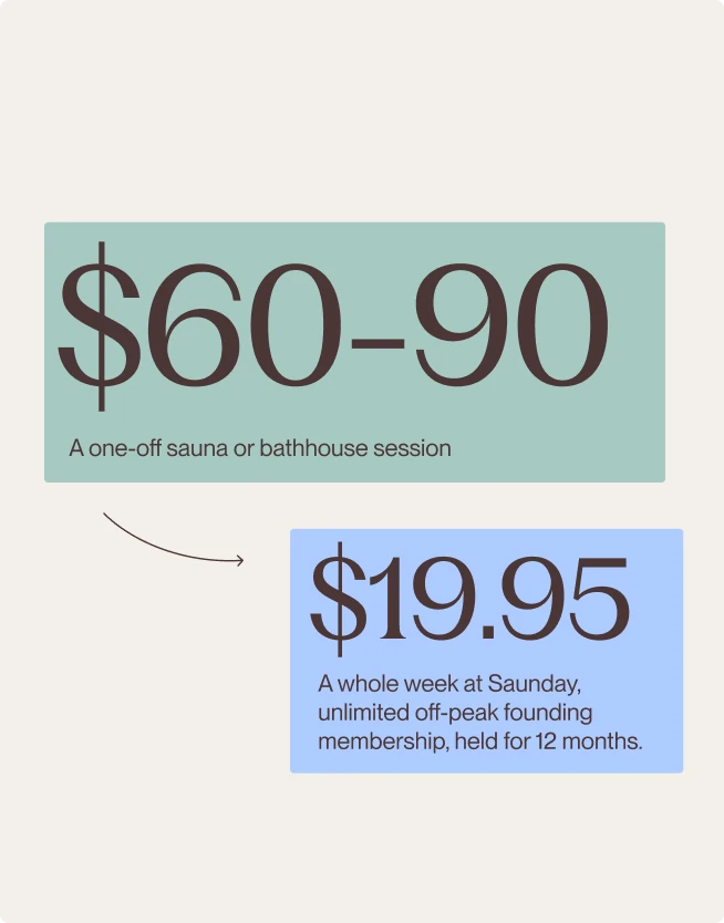
Most saunas are a one-off treat. Saunday wanted to be the opposite: a local sauna you visit every week, priced against a pub round, where you start to recognise faces on the bench. The brand had to feel warm, social and a little playful, and stay honest about wellness without promising miracles.

A tile for every session
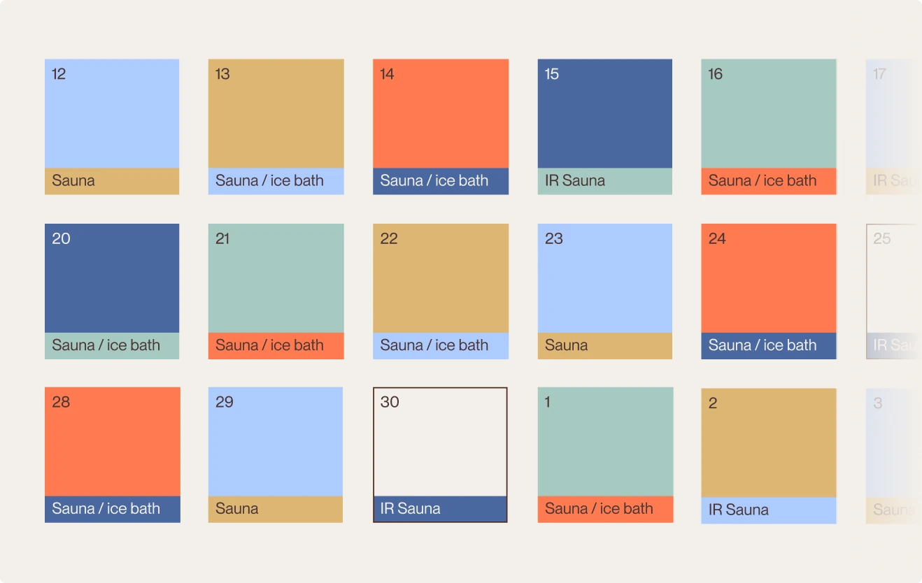
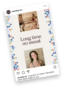
The identity is built from the tiles you find on the wall inside Saunday. Each colour maps to a session type, so a week of sauna and ice bath bookings becomes its own mosaic. The same squares dissolve across print, the shopfront, the app and every post.
Out in the world
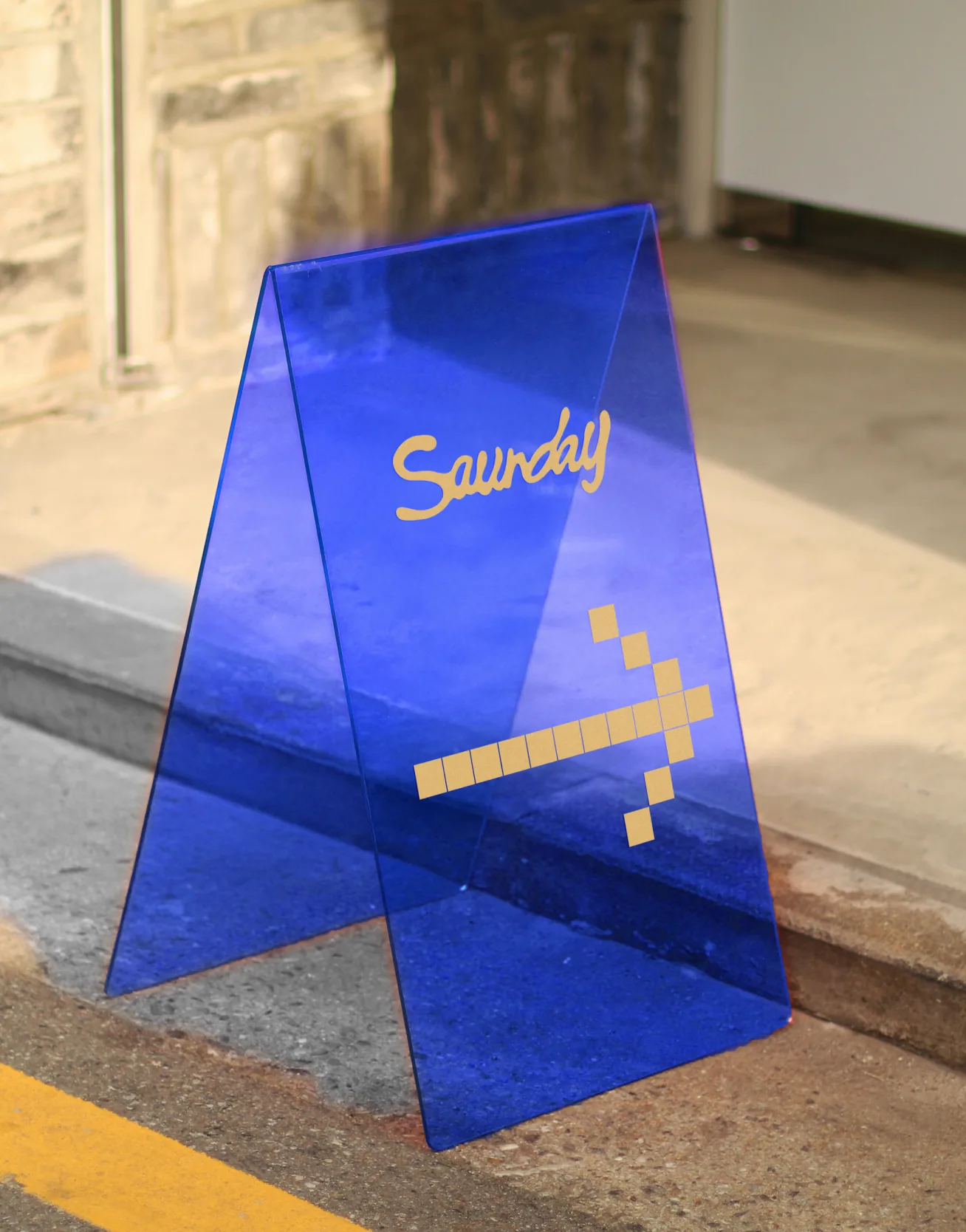
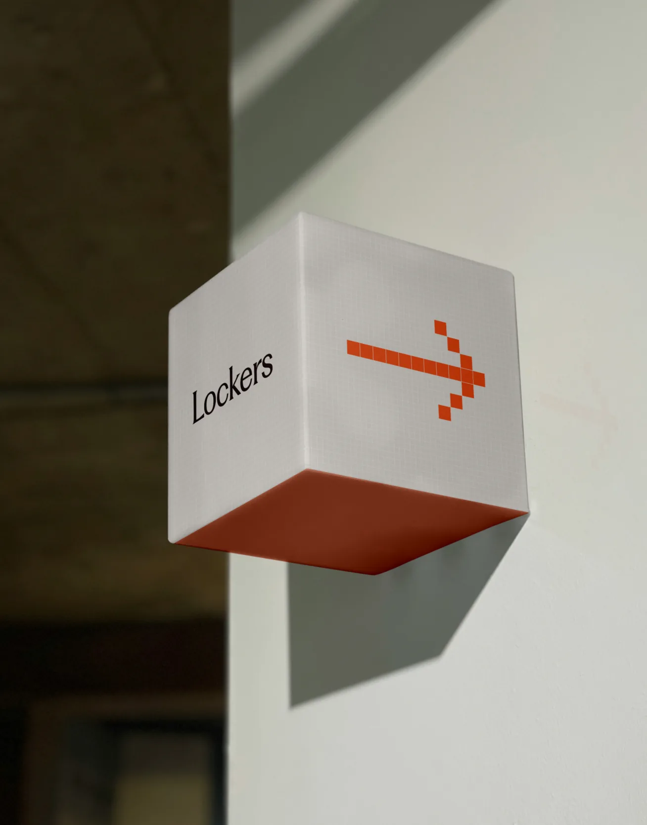
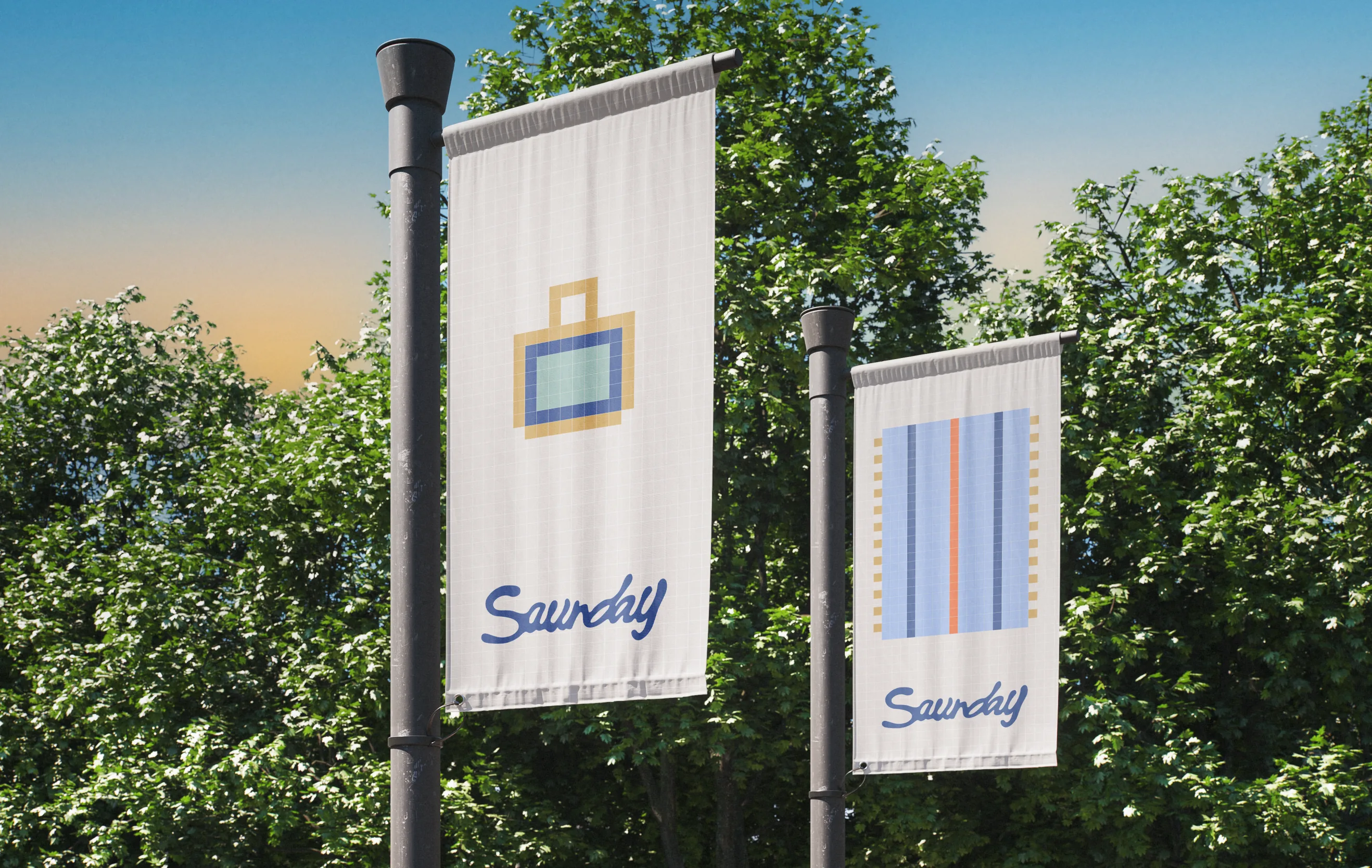
The system had to work on the street before the doors opened. Pole banners and an A-frame on the footpath, wayfinding that points you to the lockers, flyers, and a set of pixel icons built from the same tile grid as everything else, so every touchpoint feels consistent.

Driven by community
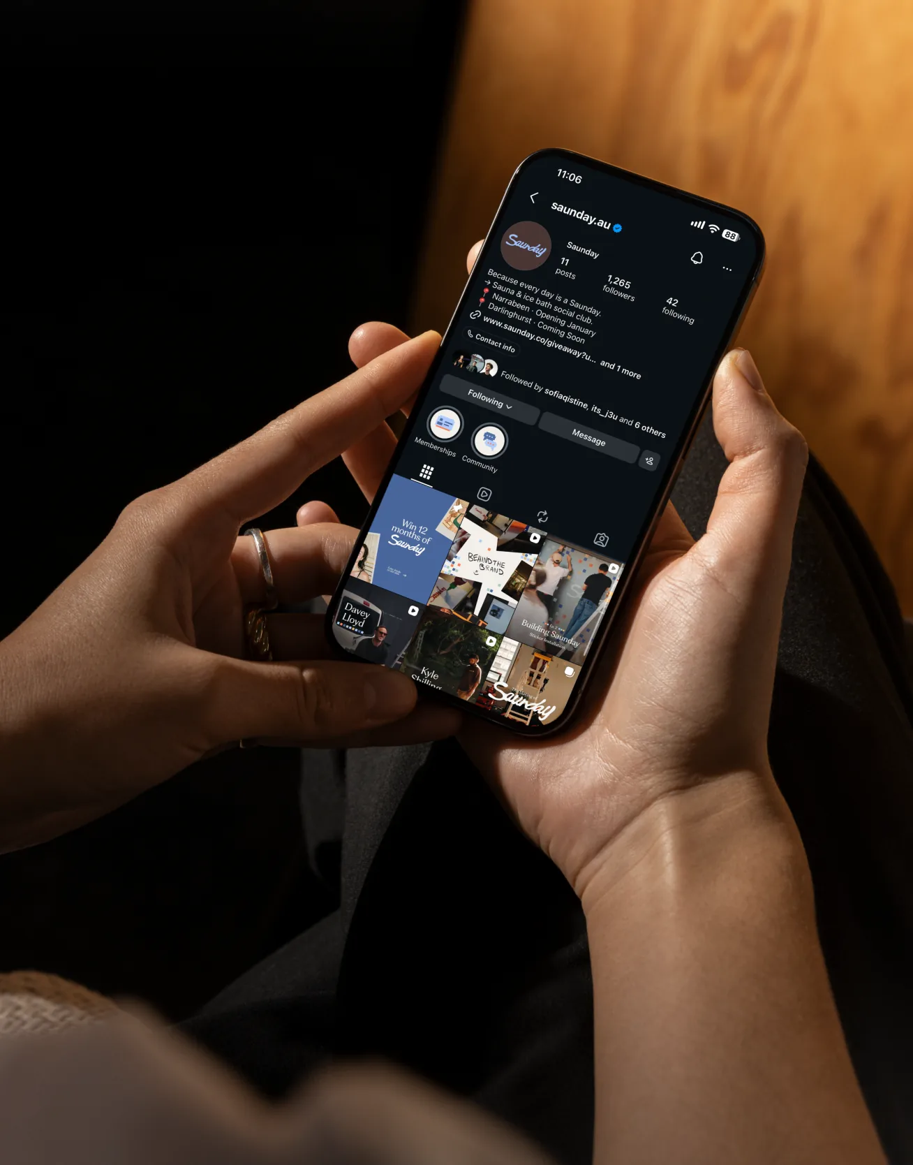
Saunday is being built with the people who will use it. We shaped a launch campaign around a hero community of surfers, runners, creators and locals.
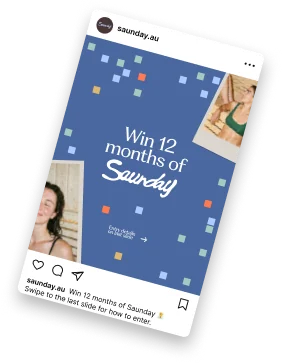
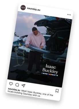

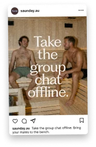
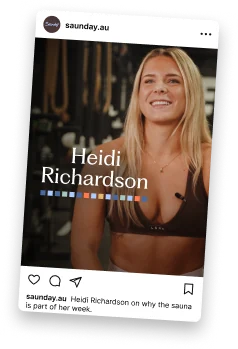
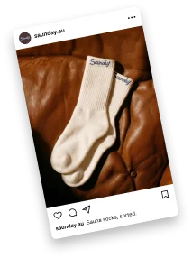
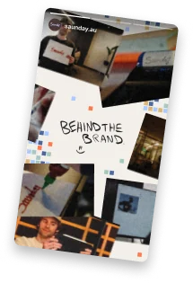
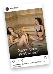
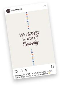
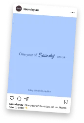
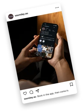
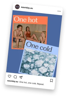
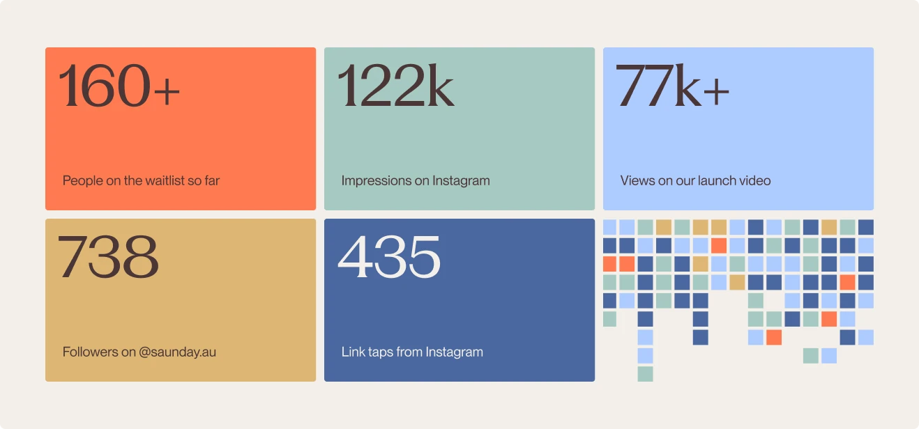
Launch campaign
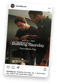
From waitlist to doors open, the system carries the whole launch: founding memberships, the build series on socials, the shopfront signage. Every touchpoint shares one wordmark, one tile grid and one palette, allowing Saunday to feel like a place you already know by the time it opens.